My Stock market trend analysis is likely different from what you think is about to unfold. Keep an open mind as this is just showing you both sides of the coin from a technical stand point. Remember, the market likes to trend in the direction which causes the most investor pain.

Since the stock market bottom in 2009 equities has been rising which is great, but this train could be setting up to do the unthinkable. What do I mean? Well, let’s take a look at the two possible outcomes.

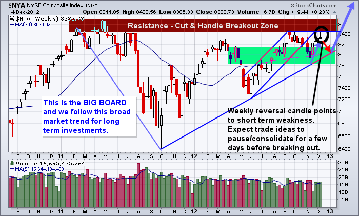
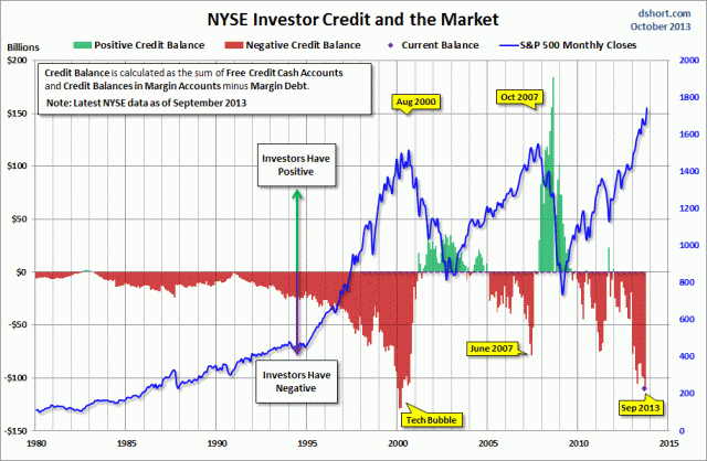
The Bear Market Trend & Investor Negative Credit

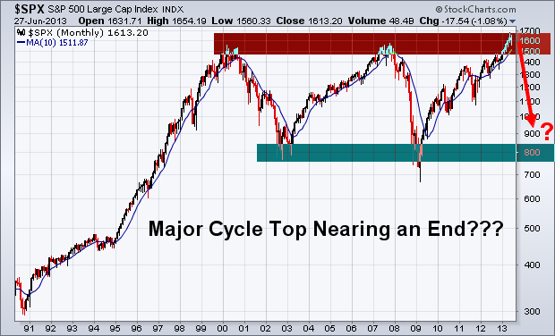
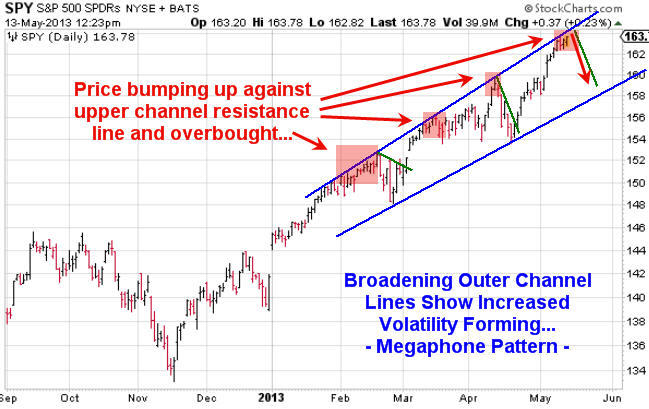
The S&P500 has been forming a large broadening formation over the last 13 years. The recent run to new highs and record amounts of money being borrowed to buy stocks on margin has me skeptical about prices continuing higher.

Take a look at the chart below which I found on the ZeroHedge website last week. This chart shows the SP500 index relative to positive and negative investor credit balances. As you can see we are starting to reach some extreme leverage again on the stock market. I do feel we are close to a strong correction or possible bear market, but we must remember that a correction may be all we get. It does not take much for this type of borrowed money to be washed clean and removed. A simple 2-6 week correction will do this and then stocks will be free to continue higher.

credit


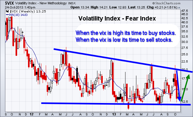
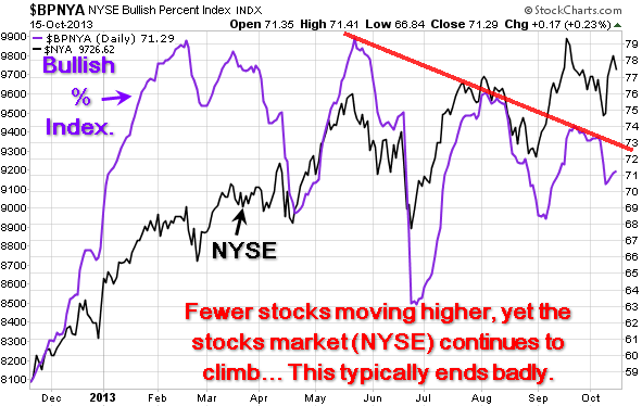
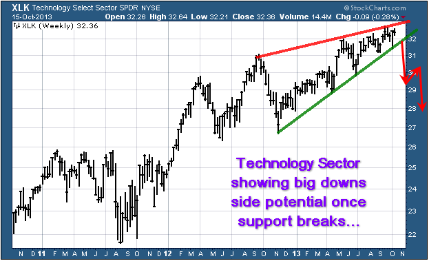
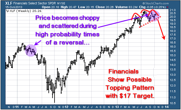
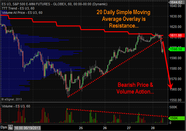
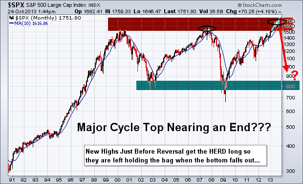
Monthly Bearish Trend Outlook

Below you can see the simple logical move that should occur next for stocks based on the average bull market lasts four years (it has been four years) and the fact the negative credit is so high again.

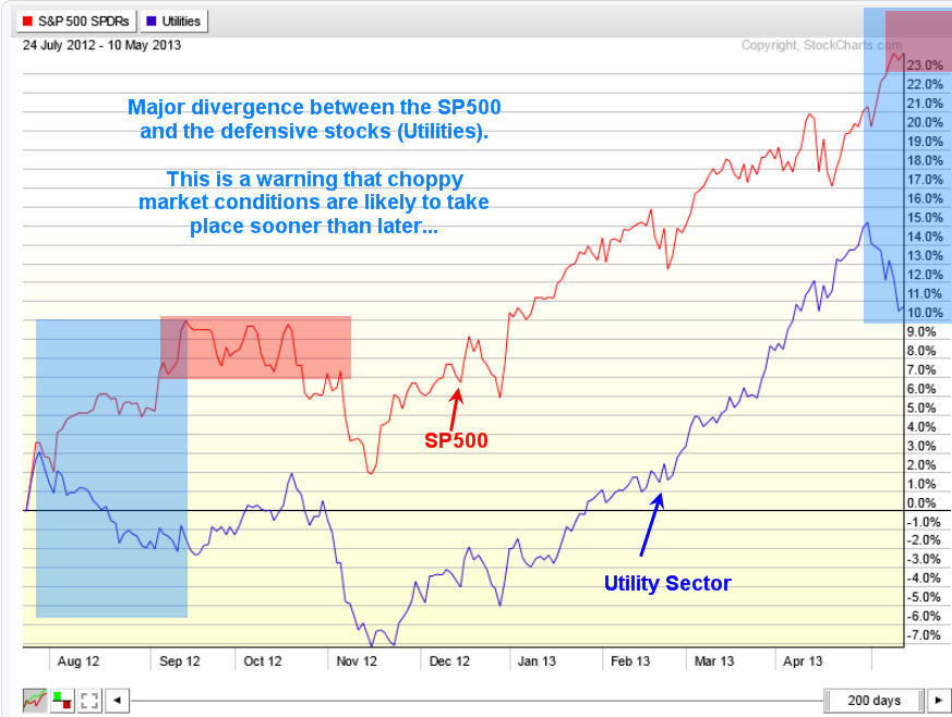
Also, poor earnings continue to be released for many individual names across all sectors of the market. While corporate profits may be holding up or growing in some of the big name stocks, revenues are not. This means the big guys are simply laying off workers and cutting costs still.

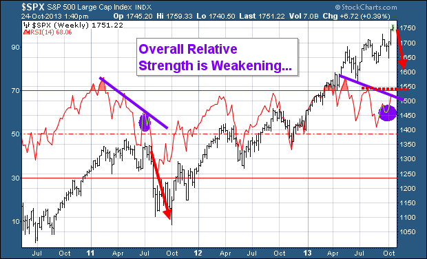
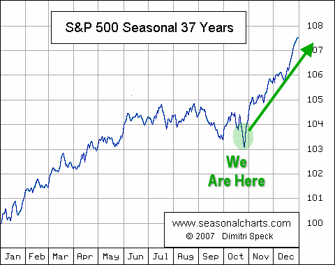
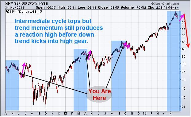
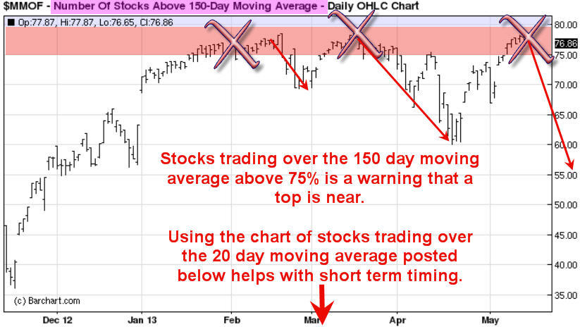
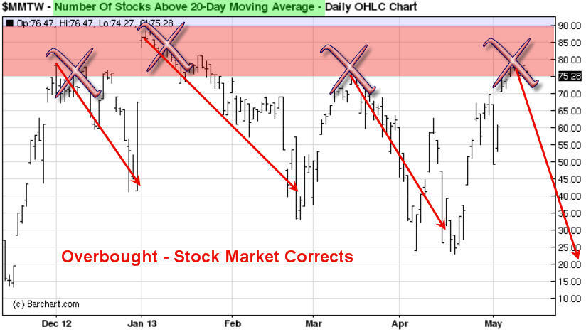
Overall the stock market is entering its strongest period of the year. So things could get choppy here with strong up and down days until Jan. After that stocks could start to top out and eventually confirm a down trend. Keep in mind, major market tops are a process. They take 6-12 months to form so do not think this is a simple short trade. The market will be choppy until a confirmed down trend is in place.

MajorBear


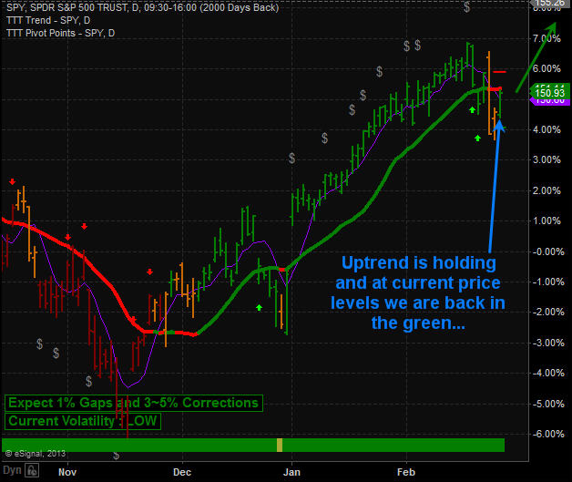
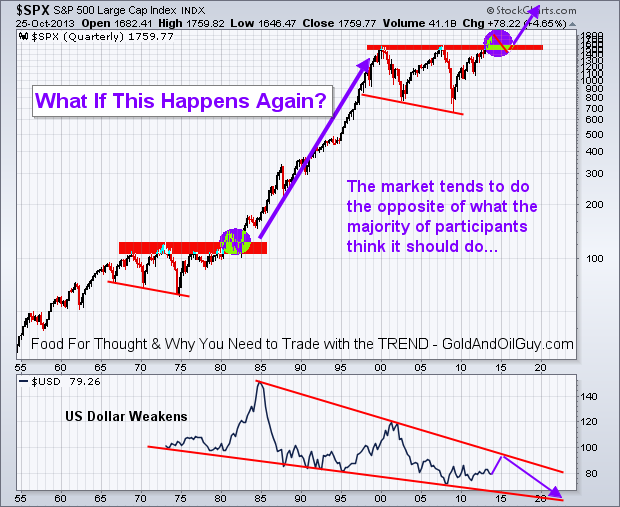
Monthly BULLISH Trend Outlook

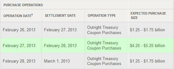
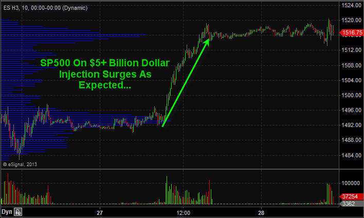
This scenario is the least likely one floating around market participant’s minds. It just does not seem possible with the global issues trying to be resolved. With the Federal Reserve continuing to print tens of billions of dollars each month inflating the stocks market this bullish scenario has some legs to stand on and makes for the perfect “Wall of Worry” for stocks to climb.

The US dollar is likely to continue falling in the long run, but I do not think it will collapse. Instead, it will likely grind lower and trade almost in a sideways pattern for years to come.

FoodForThought


Major Stock Market Trend Conclusion:

In summary, I remain bullish with the trend, but once price and the technical indicators confirm a down trend I will happily jump ships and take advantage of lower prices.

Remember, this is big picture stuff using Monthly and quarterly charts. So these plays will take some time to unfold and within these larger moves are many shorter term opportunities that we will be trading regardless of which direction the market is trending. As active traders and investors we will profit either way.

Get My Reports Free at: www.GoldAndOilguy.com

Chris Vermeulen


Traders and investors all around the world is having trouble climbing over the wall of worry/fear with the US stock market, and rightly so. There is a lot of things taking place and unfolding that carry a high level of uncertainty. Let’s face it, who wants to invest money into the market when it’s hard to come by (high unemployment, banks are still extremely tight with their money, companies are nowhere near wanting to hiring new staff).

The hard pill to swallow is the fact that the stock market loves to rise when uncertainty is high. It’s almost doing it just to drive investor’s nuts who sold out near market bottom or recent correction. You must overcome the urge to short the market when the economy looks so bearish in the years ahead, and continue to trade with the trend.

Short Term Investing – Weekly Volatility Index Chart

Below you can see the fear index. The chart is self-explanatory showing where it should move next. But if you are not familiar with the VIX then here is definition by investopedia:

“The first VIX, introduced by the CBOE in 1993, was a weighted measure of the implied volatility of eight S&P 100 at-the-money put and call options. Ten years later, it expanded to use options based on a broader index, the S&P 500, which allows for a more accurate view of investors’ expectations on future market volatility. VIX values greater than 30 are generally associated with a large amount of volatility as a result of investor fear or uncertainty, while values below 20 generally correspond to less stressful, even complacent, times in the markets.”

VixBottom


Weekly Investing Chart of the SP500 Index

After reviewing the VIX chart above which points to stocks nearing a level of selling pressure, then review the chart below we come to a conclusion that a minor pullback of 2-5% is likely to take place in the next week ortwo.

The divergence in the Relative Strength Index is a bearish sign for the broad market. While I feel a pullback is do and needed for the market to regroup, it is important to review the seasonality chart and know that we are entering one the strongest times of the year for stocks.

SP500Divergence


SP500 Seasonality Chart

Again, using the data from the previous two charts along with this graph clearly shows that a pullback in the stocks is likely going to be bought back up by the brave investors willing to override their fear and go with the trend. For more interesting charts check out my stock chartlists: https://stockcharts.com/public/1992897

 SP-Seasonality


The Wall Of Worry Conclusion:

In short, expect the stock market to correct in the next week or two. But once we get a correction of two percent or more, be prepared for buyers to step back in and buy things up into year end.

This WALL OF WORRY is about to GET HIGHER!

Get These Reports Delivered To
You Inbox Each Week Free:
www.GoldAndOilGuy.com

Chris Vermeulen

Last week on October 8th the financial market experienced a broad based sell off. Every sector was down with utilities being the only exception.

The individual leadership stocks, which are typically small to mid-cap companies (IWM – Russell 2K) that have a strong history and outlook of earnings growth, were hit hard as well.

Whenever the broad market experiences a price correction, one of the most important factors I analyze is how well leading stocks hold up and show relative strength to the broad market.

So, where does this leave us going forward?

When stocks that have been leading the market higher and only pausing during market corrections in the S&P500, Dow, and NASDAQ, it’s a positive sign. This tells us investors and big money continues to flow into the risk on assets (stocks).

Conversely, when these leading stocks/sectors begin succumbing to the selling pressure of the broad market, it quickly grabs my attention and tells us it’s time to be aware that a major top may be forming.

It looks as though the broad market rally is just barely hanging on. If the leading stocks and sectors begin breaking below their 50-day moving averages, my proprietary SP500 Market Timing & Trading System will shift to sell mode and things could get ugly for those who do not know how to trade a bear market.

Weekly Relative Strength Showing Negative Divergence

This chart has two important things I would like to point out. First is the fact that the RSI has being overbought twice in the past three years with the most recent one taking place a few months ago. The last time this took place the SP500 had a very strong correction.

The second insight the RSI is providing us with is the diverging price and relative strength as shown with the purple lines on the chart below. This is telling us that the power/momentum behind the market is slowing.

div1


Daily Bullish Percent Index – Shows Negative Divergence

I always prefer to watch and analyze the NYSE as it’s the big board where all the HUGE money is flowing from traders and investors. The chart below clearly shows that less stocks are moving higher as seen with the purple bullish percent index line. With less stocks making new highs, yet the stock market continues to climb this is a warning sign that this bull market is slowly running out of steam.


div2


Technology & Financial Sector Are Rising But For How Long?

Two very powerful sectors are holding up well but once they start to breakdown from these chart patterns things could get ugly real quick. Our 3x ETF trading newsletter becomes very active in bear markets as the upside potential is much larger.

The XLK technology sector looks to be forming a bearish rising wedge. If/once it starts to slide it will have a strong impact on the broad market.

div3

Financial Sector XLF

The recent price action of scattered trading ranges looks to be similar to the top we saw in 2011. If this is the case then we have bearish head & shoulders pattern with a rising neckline forming. Once price breaks through the neck line we should expect sharp drop in price.

This sector is heavily weighted in the SP500 so if it start to drop, expect the SP500 to fall with it.

dvi4


Major Market Top Lurking…

The chart below pointing out the next bear market likely to take place is a scary looking chart to most individuals. But if you know what you are doing, they can provide more profits in a shorter period of time than a four year bull market.

If this market is starting to stall out and is in the process of forming a top. Keep in mind that market tops are a process. They take typically 3-6 months to form before a true breakdown occurs and the bear market starts. And until then, price will be choppy and difficult to trade.

majorcycle


Cautious Trading Conclusion:

In short, this report shows you some major divergences in the financial market. Remember, you do not really trade off divergences, as they are not good at timing. They are simply a warning sign telling us that something large is brewing and that risk is higher than normal.

There are few ETFs I like on various sectors and commodities that show some oversized upside potential in the coming weeks/months. Depending on what takes place in Washington this week will move the market and likely trigger some sharp moves. Until then, sitting tight is the safe play.

Get my trading reports and my trade alerts at www.TheGoldAndOilGuy.com

Chris Vermeulen

Stocks managed their third session higher as of Thursday June 27th and its too late to jump onto that move. Major indexes and leading stocks have rebounded into resistance along with a few key moving averages. The next 1-3 days favor a pause or pullback at the least simply because of the selling momentum and multiple resistance levels being tested. It is only natural for traders and investors to pull some money off the table or short at these levels.

Stepping back seven days and looking at the overall stock market we have seen a substantial drop in prices across the board. A Ton of stocks have formed their first impulse thrust to the downside which is typically what happens when a stock market is in a topping process (Stage 3 Distribution). The type of damage we had cannot be fixed overnight. This will be a process if it is to resolve to the upside and price action will remain wild (volatile).

The odds from a technical analysis stand point using Price, Momentum, Cycles, Volume and Moving Averages point to lower prices still to come. Actually they point to another 5% drop from the current level.

Major Points to Be Aware Of:

1. 20 Simple Moving Average is crossing below the 50SMA. Last time this took place it triggered a 5% drop in the SP500.

2. Price has bounced for three consecutive days. This typically puts the odds in favor for a pullback.

3. Price bounced and hit it’s head on the 20 and 50 moving averages on Thursday (RESISTANCE).

4. Market Time Cycles are in a decline phase meaning there will be a negative bias and seller will be actively pulling price lower on bounces.

5. Major Long Term Chart looks favorable for a bear market to start which may last 12 months. If so this is just the beginning of some scary yet highly profitable potential trades in the coming year. Stocks fall 3-7 times faster than they rise…


Daily SP500 Trend & Analysis Chart:

spydaily


Long Term SP500 Trend Chart:

spymonthly


BEARISH SP500 Price & Volume – 60 Minute Intraday Chart:

spyintraday


Looking at these charts from a long term, intermediate and short term basis the odds are favoring lower prices. Being short stocks or buying inverse ETF’s is the current play for the market. But analysis and trends are subject to change depending on price and volume action each week. Do not get your heart set on the BIG picture outlook of a yearlong selloff. That could prove to be dangerous. We take this market one bar or candlestick at a time and trade based on current short term analysis.

Get My Trade Alerts & Pre-Market Video Analysis Every Day: www.GoldAndOilGuy.com

Chris Vermeulen

Timing stock market tops and bottoms is risky business and we all know the more the more risk we take the more potential gain would could also made. Correctly timing a top or bottom for any investment is flat out exciting not to mention financially rewarding. But this high risk trading tactic does come with some major issues which you must FULLY understand so that you can protect your capital and self-confidence.

On May 13th I wrote a special report on how to spot market tops just before they happen and how to do it with a very high probability of success. I also explain the major pit falls to be aware of so you stay on the right side of the market.

I recommend you read this special report now: http://www.thegoldandoilguy.com/how-to-spot-time-stock-market-tops/

That special report truly showed you what was going to happen a few weeks before it did. Much like how this report shows you what is likely to happen in June.

Looking at the market with my YOU ARE HERE type of using cycles, volume, price patterns and momentum to forecast what is likely to unfold in the coming weeks. Depending on the time frame used for my analysis I can figure out with a high probability where price will be in a few minutes, hours or days also.

Mall Market Directory – You Are Here

Stock market tops are tough to trade and time. That is because there are so many things happening in the media and emotions running wild that it’s tough to get a grasp on what you should really be focusing on to keep a level head trade around it.

Market tops are typically not an event but rather a progression that takes much longer than most individuals expect. I still find myself jumping the gun at times and I know this and have been through this process hundreds of times in various investments. The human brain is a powerful tool but emotions can force you to override your rules/strategy still.

U-R-Hear

Stop Fighting! – Bulls & Bears are BOTH Correct at this Stage

It does not matter where you go to get your stock market news and reports… Everyone is arguing their bullish or bearish case more than EVERY. There is a reason for this and it’s because the SP500, DJIA, RUT and NASDAQ appear to be entering a cycle top. What does this mean? It means the uptrend is almost over from a technical analyst point of view, and those who are have been bearish for a long time feel the market topping out more now than ever in their gut that this is the top.

Keeping it simple removing news, economic data, emotions and biases we are left with one thing which is technical analysis. This is based on price alone and that is important to remember because the only thing that pays you money for an investment is when price moves in your favor. Believe it or not price only has blips on the charts here and there which is based off news, economic data etc… In the big picture stock prices tend to lead economic data by several months and in some cases years.

So the big question is this… If price action is the only thing that pays you when trading why bother worrying about all the other opinions, news out there. That stuff only adds to the confusion and in most cases gets you on the wrong side of the market.

Timing the Market Top Conclusion:

In short, from a technical point of view the SP500 remains in an uptrend. But according to technical analysis the upside momentum is starting to slow. If we get a few more down days then the trend will flip and be down but it has not yet happened.

When the trend does reverse down you must remember that 80% of the time price will bounce back up to test near the recent highs before truly rolling over and collapsing. Think of it like a zombie movie. Just when you think you killed one it comes back to life for one last scare before its dead.

Just to touch on stock market bottoms so you do not get confused. Stock market bottoms are little different than tops so they are traded differently. I will cover them when the time comes.

Trading the market is not easy during this type of condition, which is why members and myself got long SSO on the 23rd and two days later sold out for a 3.5% gain. I am now looking to reload this week for another bounce/rally play but only time will tell if we get another setup.

Download my FREE eBook on Controlling Your Trades, Money & Emotions: http://www.thegoldandoilguy.com/trade-money-emotions.php

Chris Vermeulen

Since the middle of April everyone and including their grandmother seems to have been building a short position in the equities market and we know picking tops or bottoms fighting the major underlying trend is risky business but most individuals cannot resist.

The rush one gets trying to pick a major top or bottom is flat out exciting and that is what makes it so darn addicting and irresistible. If you have ever nailed a market top or bottom then you know just how much money can be made. That one big win naturally draws you back to keep doing it much like how a casino works. The chemicals released in the brain during these extremely exciting times are strong enough that even the most focused traders fall victim to breaking rules and trying these type of bets/trades.

So if are going to try to pick a top you better be sure the charts and odds are leaning in your favor as much as possible before starting to build a position.

Below are a few charts with my analysis and thoughts overlaid showing you some of the things I look at when thinking about a counter trend trade like picking a top within a bull market.

Utility Stocks vs SP500 Index Daily Performance Chart:

The SPY and XLU performance chart below clearly shows how the majority of traders move out of the slow moving defensive stocks (utilities – XLU) and starts to put their money into more risky stocks. This helps boost the broad market. I see the same thing in bonds and gold this month which is a sign that a market top is nearing.

That being said when a market tops it is generally a process which takes time. Most traders think tops area one day event but most of the times it takes weeks to unfold as the upward momentum slows and the big smart money players slowly hand off their long positions to the greedy emotion drove traders.

Look at the chart below and notice the first red box during September and October. As you can see it took nearly 6 weeks for that top to form before actually falling off. That same thing could easily happen again this time, though I do feel it will be more violent this time around.

SPYXLU


SPY ETF Trading Chart Shows Instability and Resistance:

Using simple trend line analysis we see the equities market is trading at resistance and sideways or lower prices are more likely in the next week or two.

SPYResistance


Stocks Trading Above 150 Day Moving Average Chart:

This chart because it’s based on a very long term moving average (150sma) is a slow mover and does not work well for timing traded. But with that said it does clearly warn you when stocks are getting a little overpriced and sellers could start at any time.

General rule is not to invest money on the long side when this chart is above the 75% level. Rather wait for a pullback below it.

BarC150


Stocks Trading Above 20 Day Moving Average Chart:

This chart is based on the 20 day moving average which moves quickly. Because it reacts quicker to recent price action it can be a great help in timing an entry point for a market top or bottom. It does not pin point the day/top it does give you a one or two week window of when price should start to correct. You can view this chart below live but without my analysis here: http://www.thetechnicaltraders.com/stock-market-momentum/

BarC20


How to Spot and Time Stock Market Tops Conclusion:

As we all know or will soon find out, trading is one of the toughest businesses or and one of the most expensive hobbies that one will try to master. Hence the 95-99% failure rate of individuals who try to understand how the market functions, position management, how to control their own emotions and to create/follow a winning strategy.

With over 8000 public traded stocks, exchange traded funds, options, bonds, commodities, futures, forex, currencies etc… to pick from its easy to get overwhelmed and just start doing more or less random trades without a proven, documented rule based strategy. This type of trading results in frustration, loss of money and the eventual closure of a trading account. During this process most individuals will also lose friends, family and in many cased self-confidence.

So the next time you think about betting against the trend to pick a top or a bottom you better make darn sure you have waited well beyond the first day you feel like the market is topping out. Stocks trading over the 150 and 20 day moving averages should be in the upper reversal zones and money should be flowing out of bonds and other safe haven/defensive stocks to fuel the last rally/surge higher in the broad market.

Also I would like to note that I do follow the index futures and volume very closely on both the intraday and daily charts. This is where the big money does a lot of trading. Knowing when futures contracts are being sold or bought with heavy volume is very important data in helping time tops and bottoms more accurately. And the more experience you have in trading also plays a large part in your success in trading tops and bottoms.

Download my FREE eBook on Controlling Your Trades, Money & Emotions: http://www.thegoldandoilguy.com/trade-money-emotions.php

Chris Vermeulen

Trading with the trend should be your main focus for long term success no matter what type of trader you are (Options Trader, Stock Trader, or ETF Trader) although it’s not as easy as it sounds.

The good news is that there is a simple trading model that removes 95% of trading analysis and greatly reduces trading related emotions because the key technical analysis rules based on one of the world’s best chart technicians (John Murphy) technical analysis methods have been applied to the chart automatically. The key is to identify the trend of the market. Once that is known you can focus on trading strategies that take advantage of the current trend.

Over the past few years I have been creating this indicator/chart layout tool which converts my chart reading experience, tips and tricks into a simple system removing analysis paralysis which cause most individuals to second guess what they see and don’t pull the trigger. Using too many indicators or read/listening several other traders commentaries with different views than you causes this paralysis.

My simple red light, green light model clearly shows a viewer the current trend and expected price range (high and low) looking forward a couple days. I uses a series of data points like volatility, volume, cycles, momentum, chart patterns and logic rules. It even shows extreme pivot points helping you find low risk entry prices for both bull and bear market conditions.

Recent trends and signals for the SP500 Index Daily Chart:

SPY1

Trading With the Trend – The Sweet Spots

Knowing the direction of the market is simple using the chart system above but trading with the trend is not that simple because of natural human behavior. Instead traders fall victim to trying to pick a top or bottom because they think the price is overbought or oversold and they want to catch the next big trend change.

We all know the saying “the market climbs a wall of worry”. Well, the biggest worry most traders have is buying long in a bull market because stocks and price always look overbought and ready to top each week… This leads to people trying to get fancy picking a top only to get their head handed to them a few days or weeks later depending on how stubborn they are to exit a losing position.

The key to long term success is to buy during broad market (SP500) corrections once sentiment, cycles and momentum are starting to flash extreme oversold conditions. These show up as green arrows on the trend chart. At that point most sectors and high beta stocks like IBM, GOOG etc… should be at a key entry points with most of the downside risk removed already. Remember ¾ stocks follow the broad market so it only makes sense to follow it also.

What about a runaway stock market? This is when the stock market does not pullback but just keep grinding its way higher and higher… The only thing you can do is sit in cash, or look for a stock or sector that is having a small pause or pullback and get long with a small position until you get that broad market pullback and major by signal to add more.

Below are a few sectors showing a minor pause/pullback within this bull market.

XLP

XLI XLU XLF


Mid-Week Trend Conclusion:

Overall, the broad market remains in an uptrend. While I would like to see the SP500 pullback and give us another major buy signal like it did in December and February I do mind that much if prices keep running higher as it just give us more cushion and potential profits for when the trend does eventually roll over and flip signals. I hope you found this report interesting. It’s just scratching the surface of this topic but it’s a start.

Know the stock market trends by joining my free newsletter: www.GoldAndOilGuy.com

Chris Vermeulen

This week I talked about how the uptrend is to be the focus of trading positions until a down trend is actually confirmed via price and volume action. The SP500 was very close to reversing down this week but with the POMO’s (permanent open market operations) scheduled largest injection of money for February of over $5 billion dollars sent stocks soaring jamming stocks back up into its uptrend.

Take a look at the normal daily injections and then look at Feb 27th’s….

pomo2


SP500 Futures 10 Minute Chart Zoomed Back 48 Hours…

MarketPomoPush


SP500 Trend – Green, Orange, Red candles indicate trend direction

PomomSavesUpTrend


Short Term Trading Conclusion:

Following the bigger underlying trend of the market along with the big money will keep you on the right side of the market more times than not. My trading strategy which is now programmed into my trading system clearly tells me the current market trend, entry signals, profit taking, stop adjustments and exit prices.

Creating a proven trading strategy which works in all market conditions and having it programmed to do 95% of the analysis for you keep my trading emotions in check, saves me time and money and keeps things simple which is the key for long term success. So keep your eye on the POMO’s injection schedule each month for days to focus on long day trades or entry points for swing trades.

Receive Free Weekly Reports, Trading Tips and my Book: www.GoldAndOilGuy.com

Chris Vermeulen

Chris Vermeulen – www.TheGoldAndOilGuy.com

We all want new and exciting electronic gizmos and gadgets for the holiday season. Unfortunately they have the tendency to lose almost all their value within weeks because of newer versions etc… but what if you just got a lump of dirty old coal in your stocking, how would you feel?

The only individuals who would appreciate a dirty gift like that would be those forward looking investors who see major opportunities before they become the next big movers and headline news.

Knowing how to spot Stage 1 patterns is one of the most important bits of information you need to know as an investor. This one pattern is how I found RIMM which now up 100% in the past 30 days, ANR up 30% in two weeks, FSLR up 20% in 20 days and the list goes one. My main focus is on ETFs because of lower risk they provide but very powerful when applied to individual stocks.

Coal and coal stocks have been out of favor for almost two years now. But these unwanted and hated shares may soon be owned by the masses, or at least by traders and investors. A few weeks ago to I talked about the four stages all investments go through and which patters you must be able to spot in order to make huge money investing while having very limited downside risk.

You can read about them here where I used Apple and Research In Motion shares as my example: http://www.thegoldandoilguy.com/collapse-of-apple-rise-of-the-blackberries-stock-market-cycle/

In summary, Trade with the BIG BOARD and only focusing on buying stocks, ETFs etc… as they are coming out of a Stage 1 Accumulation Basing Pattern. This puts the odds greatly in your favor for not only winning the majority of your trades but to generate above average returns.

The BIG BOARD – NYSE – Weekly Major Stock Market Trend

The New York Stock Exchange is the big board. This chart formed a reversal candle last week which points to lower prices. Its likely we see a 1-2 week dip before buyers step back in. Until then individual stocks should pause or form mini bull flags until the sellers are finished and buyers step back into risk on assets (equities).

NYSEWeekly

Coal Sector ETF Showing Stage 1 Basing Pattern

Coal stocks have been bouncing bottom for some time and if you did not review the Stages Report using the link above then do so now so you know what to expect in detail.

KOL coal exchange traded fund is a basket of coal companies and is starting to show signs of a new bull market. A breakout and close above $26.00 should trigger strong buying with the potential of a 21% gain before it hits my first price target. This could go way past that but one target at a time folks.

Naturally I would like to see a bull flag or pause in KOL over the next couple weeks, then look to get long using the pivot low of that pause/bull flag as my protective stop. I’m not jumping in here as the broad market looks ready to correct and ¾ stocks follow the big board which will pull KOL down.

KOLBase


ANR – My Top Coal Stock Pick

I pointed out ANR at $7.50 at the beginning of December to followers as it was the best looking coal stock I could find. The two key indicators “Price” and “Volume” were clearly pointing to higher prices and the potential gain even if it was just played up to the Stage 1 Resistance Level still netted a 30% move. Crazy part is that there is the potential for a 100% rally to my first price target. Follow my free ideas here live: https://stockcharts.com/public/1992897

ANRCoal


You want Gizmos or Coal in You’re Stocking???

In short, I really like the coal sector for the first quarter of 2013. I’m not too worried about the fiscal cliff as it’s not the end of the world and the US along with most other countries are all bankrupt together in my opinion. New rules and ideas will be implemented and life and business will continue… I am not to worried.

I am expecting stocks to continue sideways or higher into May at which time a serious correction could take place. But not to worry as we take things one week at time and will be adjusting my outlook accordingly.

Get My Trade Ideas & Alerts Delivered To Your Inbox: www.TheGoldAndOilGuy.com

Chris Vermeulen

As mentioned last Friday just before things took a dive on the weekend, a look at the major market indices did not look promising.  If we take an even longer term look and examine the monthly charts we can see that The S&P 500 as well as the Dow Jones have been approaching multi-decade rising channel resistance lines.  Further, they also appear to be forming bearish rising wedge patterns.


Monthly Long Term Chart Analysis & Thoughts:

Monthly SPX Index Trading

As many of my longer term subscribers can attest to, I always preach that technical analysis is one part  art and one part science:  you can never be completely certain on what the outcome of a pattern is going to be.  However, we can use historical analysis to make better investments. The great American Novelist Mark Twain probably said it best in that “history does not repeat itself, but it rhymes”.  Regarding a rising wedge pattern, we know that roughly two-thirds of the time they will break to the downside.  This also means that one-third of the time they break to the upside.

In accomplishing our goal of capital growth we must do a number of things.  We must make returns on our investments, we must protect our investments, and we must limit our losses.  While all three aspects work in tandem with each other, there are times when focus must be allocated to one specific approach.

Regarding the current technical setup, I’m not so focused on the 67% chance that these wedges will break to the downside, but more so the impact of each outcome on the average Joe’s portfolio and mom and pop businesses.  The S&P 500 and the Dow are approaching long term resistance lines that have been in place for decades.  If we do break to the downside, which I suspect we will, there could be a very significant sell off with consequences that no one can predict at this point though I mention some things in the chart above.  Alternatively, there is significant overhead resistance in the various indices, and I don’t believe an upside break would be too monumental.

That being said, I always like to keep an open outlook and wait for the right opportunity.  I’m trying to think of scenarios that would prelude further upside action and I really am not coming up with much.  As evidenced by the completion of the recent 5 wave uptrend on the S&P that coincided nicely with the various quantitative easing policies, Ben Bernanke and the fed have had less and less impact.  I truly can’t see many fiscal developments that would prompt any significant bullish action.

The only scenario I really think that could pump up equities is a series of positive earnings announcements.  A lot of expectations, earnings numbers, guidance, etc… have been revised downwards over the last couple of quarters, so there is the opportunity for some positive surprises that could lead to some bullish price action.  In absence of such a scenario, I really can’t think of much else that would prompt a run up.

Look at these charts of positive and negative earnings surprises… and the dates and remember what happened following this negative data….


Positive Earnings Surprise

Earnings Positive SurprisesEarnings Positive Surprises


Negative Earnings Surprise

Earning Negative Surprises

That being said, I am recommending two courses of action.  For those steadfast bulls, lock in some profits and/or buy some protection.  Missing out on some of the upside is a lot better than losing some of the gains you have fought so hard for over the past couple of years.  For the more aggressive traders and investors, start following my updates a little more regularly as I foresee many shorting opportunities coming up in the future.  As many of you know, sell-offs are often quick and abrupt, and timing is extremely important when playing the downside.

Further, trading could get very volatile in the near future.  Historically, and even more so looking forward as August and September have been very costly for the average investor.  Our focus will be in taking the highest probability trades that offer the best risk to reward scenarios.  There will be times when we miss trades, and times when they’re not timed perfectly.  But, as those who have been with me for a while can attest to, patience pays off in the long run…

Join my Free Market Analysis & Trade Idea Newsletter Now: www.GoldAndOilGuy.com

Chris Vermeulen