Posts

Today’s gap higher in stocks has many investors feeling really good about but will this rally last?

My to the point answer is “Yes” but there will be some bumps and navigating positions along the way.

Looking at the charts below you will notice how stocks are trading up over 4% in two trading sessions and several indicators and technical resistance levels are now being tested. Naturally when several resistance levels across multiple time frames, cycles and indicators we must be open to the idea that stocks could pause or pullback for a few days before continuing higher.

Here is a quick snapshot of charts I follow closely to help determine short term overbought and oversold market conditions.
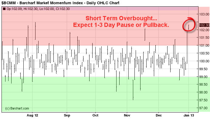
Momentum Extremes:

This chart helps me know when stocks are overbought or oversold. This trend can be follows using the 30 or 60 minute charts helping you spot short term tops and bottoms.

BroadMarketMomentum1

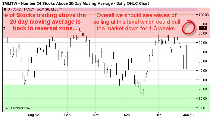
Stocks Trading Above 20 Day Moving Average:

This chart helps me time swing trades which last for 1-3 weeks in length and I use the daily chart to spot these reversals and trends.

SwingTradeOverbought2


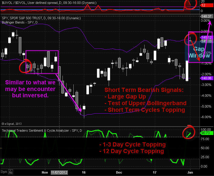
Daily SP500 Index Chart:

This chart shows the big gap in price, test of upper bollingerband, momentum and swing trading cycles topping and 12 buyers to ever one seller on the NYSE which tells me everyone is running to buy everything they can today and that is a contrarian signal.

IndexChart3


Trading Conclusion:

This strong bounce which started on Monday from a very oversold market condition does look as though it has some power behind it. And over the next 1-3 days we could see prices grind higher until this momentum stalls out. Once that happens we should see most of the gap filled. This will provide us with a lower entry price and reduce our downside risk for index, sector and commodity ETFs.

If you are a stock trader then be sure to checkout my partners stock trading website www.ActiveTradingPartners.com where his last two trades Dec 31 pocketed 12.3% with gold stocks ETF NUGT, and took more profits with PRLB Jan 2nd for a 9.2% gain.

This type of bounce and momentum can lead to a running correction which makes it impossible for traders to by on a dip. A running correction is when prices slow chop higher in a narrow range for some time then explode higher continuing its rally. This is when you just need to jump in trades and chase prices higher but we will not do that until I see signs of a running correction.

Today many of the major market moving stocks are testing resistance which means if they start to get sold the broad market will pullback with them.

Follow All My Trades for 2013 – Start Today and Get 12 Months for only 6 Months: http://www.thegoldandoilguy.com/signup-newyear.php

Chris Vermeulen

Most traders just don’t have the time to track the market on an intraday basis. Crazy thing is I found a way that takes advantage of the intraday price action ever needing to look at a single intraday chart. Now we can swing trade using the daily charts but get the added performance of watching the intraday chart price action. What also makes this strategy exciting is that it works with virtually any time frame, thought each time frame and investment vehicle will require its own custom settings in order to track properly.

I call this strategy a Momentum Trend Crossover. It’s based on 2 moving averages that use intraday day, or intra-bar price action to calculate its value. And a Donchian channel to track recent highs/lows for protective stop placement.

Below are three charts showing how it looks and works.

Close Up Of Momentum Crossovers – 30 Minute Chart

The chart below clearly shows how the two average track very closely to another. They both have slight variations in how they calculate their value. In short, when the blue moving average crosses below the red the market is in distribution mode (down trend/sell bounces). And it’s the opposite for when the blue trend line crosses above the red which is accumulation mode (up trend/buy dips).

The Donchian channel is used for entry and protective stops. This indicator has three parts, the upper, middle and lower bands. It tracks the most recent highs and lows providing clear protective stop levels for each trend.

60 Minute Chart – Moving Average Trend Trading Chart

This is an example of a 60 minute chart which I find very helpful in catching decent size trades. As you can see when the moving averages crossover the market reverses direction. The really cool thing about this is that there is almost zero lag in this indicator. Many times the cross over happens before the price starts to drop.

For best results I always make sure the next larger time frame is in favor of the trade I am looking to take. Doing this increased the probability that more trades will become profitable.

30 Minute Chart – Short Term Trend Trading

This chart shows key reversals and low risk entry points using the Donchian channel and moving average price levels. I know these are intraday charts I am showing you but it can be used with daily weekly and monthly charts also. The intraday charts really show it in action and how choppy market conditions can be filtered to be smooth.

Momentum Trend Crossover Benefits:
• Can be applied to any investment vehicle – Stocks, ETFs, Futures, Currencies
• Customizable to work with any time frame
• The trend is your friend and this always keeps you inline with the trend.
• Eliminates the noise in the market during choppy conditions
• Reduces emotions because you instantly can see when to enter and exit positions

My Thoughts On This Trading Model

I have never been a fan of Moving averages because they lag the market so much. Over the years watching intraday price action in conjunction with the daily chart I found a way to make the moving averages carry over the intraday strength/weakness which in turn gives us an almost real-time, if not early signal about a trend change.

This is one of the strategies I use within my trading newsletters to help generate low risk trading signals. Takes some of the guess work out of trading, that’s for sure!

If you would like to get my trading alerts and learn more about this, please go to www.TheGoldAndOilGuy.com to see what I have to offer.

Chris Vermeulen

GET MY FREE WEEKLY TRADING REPORTS DIRECTLY IN YOUR INBOX

This week has been playing out as we expected. Last week we saw the market rally on light volume into a resistance zone on the daily chart. Light volume rallies are always a warning sign, much like the “Calm before a Storm”.

The way I look at bearish price action:

The First Heavy Selling Volume Day – I see this as large institution selling massive amounts of investments (stocks & commodities) because prices have risen enough for them to book profits OR they know something we don’t and they are getting out before the majority of traders find out.

Light Volume Rally/Drift Higher – After a heavy volume sell off we tend to see prices drift higher on light volume. This is when the institutions stop dumping investments and allow the retail investors (Un-educated Traders) to buy the market back up.

Bear Market Trend – In a down trend we see these two phases enter and exit the market. These patterns happen on every time frame from tick charts to yearly charts. Trends vary in length from 1-2 cycles and sometimes 10-20 cycles and more…

Current Market Conditions

So far this week we have seen the market sell down on increasing volume which is bearish and is pointing to lower prices. On Wednesday we saw prices move up on light volume with volatility rising into the close with a short wave of selling. This was indicating to me that sellers were starting to enter the market again.

The daily chart below clearly shows the heavy selling and drift higher on declining volume. The market is now trading deep into a resistance zone and looking ready to drop.

SP500 Intraday 2 Hour Candle Charts

You can see the same selling patterns repeat themselves. Since the Feb 5th bottom we have been forming a much larger bear flag which makes me think a BIG drop is only days away.

SP500 Trend Trading Conclusion:

Both stocks and precious metals are trading with the same chart patterns and volume levels. So if you are wondering about gold, silver and oil, I am seeing a similar scenario playing out for them also.

The reason I keep bringing these bearish patterns up in my reports is because once you master trading in a down market then you can make money during some of the fasted moving times in the market. I have always preferred shorting the market because prices drop much quicker then they rise. So profits are made quickly.

Also, if the broad market does eventually roll over later this year, and I am not saying it is, but “IF” it does, then you will feel somewhat comfortable with the positions we will be taking.

If you would like to receive these Free Bi-Weekly Trading Reports please visit my service for TheGoldAndOilGuy at: www.TheTechnicalTraders.com

Chris Vermeulen