I believe the outcome of the past 6+ months with regards to global trade, currency devaluations, and consumer sentiment will result in weaker US earnings in Q2 than at any time over the past 3+ years. We believe US stocks, after recently breaching key psychological price levels ($300 SPY and $3000 ES) are poised to set up a sideways Pennant price pattern formation headed into a key price breakdown near the middle of August 2019.
Our cycle indicator tools and predictive modeling suggests that August 19, 2019, is the date to watch out for and after that date, we believe the US and global stock markets may begin a new downward price phase that could lead to a dramatic price decline. Read our August 19 Top warning here
This week I will share a report showing some really interesting charts rm a very different point of view that signal a larger correction is coming based on some leading sectors and proprietary analysis. You can get this report by joining my free newsletter located at the bottom of my Current Index Trade Signal Page here.
Earning Season Expectations For This Week
Early this week, July 15 through July 19, a total of 173 companies will be reporting earnings – including a number of very large firms such as Bank Of America (BAC), Alcoa (AA), US Bancorp (USB), IBM, Bank of New York Mellon Corp (BK), E-Bay (EBAY), Netflix (NFLX), Charles Schwab (SCHW), Citigroup (C), United Airlines (UAL), JP Morgan Chase & Co (JPM), Wells Fargo & Co (WFC) and others. The mix of reporting firms this week includes financial, consumer, basic materials, healthcare, home builders and many others.
If anything has disrupted these industries over the past 3+ months it has been the shock to the markets related to the October 2018 to December 2018 US stock market price collapse and the continuing trade wars/issues with China. It is our opinion that these trade wars and pricing disruptions have resulted in a much more difficult environment for certain US and foreign nations to achieve Q2 expectations. Thus, we are planning for a few interesting surprises over the next 10 to 15+ days.
Next week, July 22 through July 26, a total of 659 companies will be reporting earnings. We believe the bulk of these earnings reports will provide increased US and global market price volatility and could actually present a number of surprise results (both positive and negative).
The Nasdaq website reported this article on June 17, 2019, which we found interesting.
Expectations for Q2 2019, and to be quite honest – the rest of 2019, is overall quite negative from this article. We believe the US markets will still be the top-performing global stock market because of the strength of the US economy and dynamic foundation of growth and opportunity going forward 2 to 4+ years. But we are very concerned that the second half of 2019 stock market correction is about to hit and shock traders with a -15% to -20% (or more) price collapse initiated by the recent psychological price levels being breached and the Q2 earnings data that could shock the global markets.
From the Nasdaq article, Zacks Sector analysis for Q2 vs. Q1 2019 shows concern in a number of sectors while Consumer Discretionary and Retail/Wholesale shows Revenues increase and Margins fall. Overall, it is quite distressing to see these expectations when one considers the strong economic data being released recently.
(Source)
The computer and technology sector seems uniquely poised for a very rough year based on Zachs expectations. Overall, Q1 2019 earnings expectations were -6.7%, Q2 2019 earnings expectations are -11.5% and Q3 earnings expectations are -11.5%. This does not look like a very positive set of data for the rest of this year and we believe this is where the real risk of a US stock market price collapse resides.
Months ago, we warned that a July 2019 market top is setting up and that we believed the US stock market would rotate much lower after a peak in July setup. About 45 days ago, we adjusted our expectations to suggest that this top would likely form in August or early September based on our predictive modeling system output and our cycle tools. We’ve honed the date down to August 19, 2019 (+/- 5 days) as the date that we believe the US stock market will TOP and/or initiate a new downside price move from this date.
You can see from the chart, below, that we believe the current price top may actually be near the highest point reached over the next 30+ days. We believe earnings data will change the dynamics of price activity and increase volatility over the next 2 to 3 weeks. Setting up a sideways Pennant price formation as the global markets and investors digest this new economic data. Ultimately, a price breakdown is likely (a price revaluation event) that will allow for continued upside price growth in the future.
This Daily DJI chart highlights our expectations and highlights our Fibonacci Price Amplitude Arcs that suggest the true price top formation will happen sometime near August 19, 2019. We believe this date is critical and that price could begin a very quick and dramatic downside price move near this date based on the data we are expecting to see from Q2 earnings.
We urge traders to plan and prepare for this potential setup by reducing risk in long positions and preparing for a potential downside price move that could be related to global market concerns, Q2 earnings data and continued global trade/economic issues.
Overall, once this price revaluation event is completed, much like the event in Oct~Dec 2018 and the event in May 2019, the US stock market will very likely resume the upward price bias/trend and continue to attempt to establish new all-time price highs into 2020 and beyond.
Price rotations, like the one we are suggesting, may happen after August 19, 2019, are very healthy for the markets. These types of moves allow price to establish support and resistance levels, revalue assets, shake out certain biases and provide for future price moves/trends.
Be prepared. The data may result in a very big increase in volatility over the next 10~15+ days and this could result in a very dramatic price correction setting up as we’ve suggested. Learn how our research team can help you stay ahead of these bigger market moves and find incredible trading opportunities as these big moves take place.
I can tell you that huge moves are about to start unfolding not only in real estate, but metals, stocks, and currencies. Some of these supercycles are going to last years. Brad Matheny goes into great detail with his simple to understand charts and guide about this. His financial market research is one of a kind and a real eye-opener. PDF guide: 2020 Cycles – The Greatest Opportunity Of Your Lifetime
As a technical analysis and trader since 1997, I have been through a few bull/bear market cycles. I believe I have a good pulse on the market and timing key turning points for both short-term swing trading and long-term investment capital. The opportunities are massive/life-changing if handled properly.
I urge you to visit my Wealth Building Newsletter and if you like what I offer, join me with the 1 or 2-year subscription to lock in the lowest rate possible, get a FREE BAR OF GOLD and ride my coattails as I navigate these financial markets and build wealth while others lose nearly everything they own during the next set of crisis’.
Chris Vermeulen
Technical Traders Ltd.
https://thegoldandoilguy.com/wp-content/uploads/2019/07/122.png543850adminhttp://www.thegoldandoilguy.com/wp-content/uploads/2014/11/tgaoglogo.pngadmin2019-07-15 21:22:192019-07-15 21:22:19Earnings may surprise the stock market – Watch Out!
We believe a unique Pennant/Flag formation is setting up in the US stock markets. We believe the Small Cap sector may provide a better technical reference to the price breakout we are expecting in late August or early September than the mid or large-cap sectors. The charts tell a very interesting story when comparing the different sectors to the SPY.
As most of you are well aware, the very deep selloff between October and December 2018 prompted a low price pivot point that most technical analysts are using as a reference to support. What we find interesting is that these Small Caps have really failed to mount any type of price recovery. We believe this is because of the continued capital shift where foreign investors and institutional investors are piling into mid-cap and large-cap equities chasing dividends and safety. The small-cap index chart may provide the best technical reference for the pennant formation and eventual breakout move.
This weekly chart of TNA highlights exactly what we are referencing in comparison to the mid-cap and large-cap charts. Pay very close attention to the support level near $53.50. Also, notice that define panic formation setting up after the December 2018 bottom. We believe the price rotation in the small-cap index is clearer and more identifiable than the rotation in the mid-And large-cap indexes. We also believe the small-cap index will show early warning signs of price weakness or strength after the apex of this move.
The mid-cap and large-cap weekly charts paint a very different picture than the small-cap chart. We can see the upward price slow after the bottom in December 2018 was much more aggressive. We can also see an upward sloping Pennant formation setting up between the lower, blue, price channel and the magenta upward sloping price channel from the recent lows. Please pay close attention to the upper and lower support zones we drawn on this chart. Any future break down in price will likely find support near the upper support zone and possibly pause near this level before attempting a breakdown further if needed.
This last SPY weekly chart highlights the similarities between the made In the large-cap indexes. The way price reacts to these channels as well as creates these Pennant formations in unison is rather interesting. Compared to the small chart, the TNA, it is clear that the main and large-cap prices are moving somewhat in tandem.
At this point in the process, we are waiting for wave 3 to end and wave 4 to begin of the pennant formation. As price continues to consolidate within the pennant range, we should take advantage of opportunities that exist within this rotation and prepare for a brief breakout to new all-time highs. After new all-time highs are reached, we believe an immediate downside price rotation will begin sometime in September 2019 and last possibly into October or November 2019 – possibly longer.
Pay attention to vertical line number 10 on this chart. This price cycle reference occurs on September 8, 2019. It also occurs right after the apex of the pennant formation between the red and magenta lines. Our researchers believe a washout high price rotation, targeting new price highs, will be the likely resulting breakout move. After the washout high exhausts, we believe an immediate downside move will likely begin and push prices back below the 282 to 270 level while attempting to find support. Ultimately this downside move may attempt to retest the 240 level or lower. Time will tell.
Our suggestion is to pay attention to the small-cap index in relation to the mid-cap and the large-cap symbols. We believe the small-cap sector will provide greater detail for technical analysts and researchers. Overall, every one of these charts paints a fairly clear picture. We believe our research is accurate and that the market will do exactly as we are suggesting. The only thing that we are unsure of, at this point, is where the new all-time high price level will peak.
Our ADL predictive modeling system is providing some guidance in regards to this peak level. We will continue to provide further guidance and research as these price swings continue. It would be wise to prepare to trade a tightening price channel as this pennant formation continues – then be prepared for some very big price swings in late August and all through September.
We have a good pulse on the major markets and can profit during times when most others can’t which is why you should join my Wealth Trading Newsletter for index, metals, and energy trade alerts.
I can tell you that huge moves are about to start unfolding not only in metals, or stocks but globally and some of these super cycles are going to last years. These super cycles starting to take place will go into 2020 and beyond which we lay out in our new PDF guide: 2020 Cycles – The Greatest Opportunity Of Your Lifetime
I am going to give away and ship out silver rounds to anyone who buys a 1-year, or 2-year subscription to my Wealth Trading Newsletter. You can upgrade to this longer-term subscription or if you are new, join one of these two plans listed below, and you will receive:
1-Year Subscription Gets One 1oz Silver Round FREE
(Could be worth hundreds of dollars)
2-Year Subscription Gets TWO 1oz Silver Rounds FREE
(Could be worth a lot in the future)
SUBSCRIBE TO MY TRADE ALERTS AND GET YOUR FREE SILVER ROUNDS!Free Shipping!
Chris Vermeulen
Founder of Technical Traders Ltd.
https://thegoldandoilguy.com/wp-content/uploads/2019/06/30.png430700adminhttp://www.thegoldandoilguy.com/wp-content/uploads/2014/11/tgaoglogo.pngadmin2019-06-20 10:32:262019-06-20 10:32:26Small Caps May Lead A Market Rally
The Technical Traders Ltd has identified a unique price to volatility relationship between the SP500 and VIX index. The calculations required to compute the VIX index are composed of a number of factors. That final value of the VIX index is reported on an annualized basis. This means that VIX index as already internalized the past 12 months price volatility into the current VIX levels.
We believe this increased VIX volatility expectation could be muting future VIX spikes and trading systems focus on the VIX Index. The fact that the VIX as likely to internalized that large October to December 2018 price rotation and will not move beyond this price range until well after April or May of 2020 creates a unique problem for VIX systems and analysts. In short, the VIX has normalized a 20% price volatility expectation, or more, and will not reduce this expectation until well after April or May of 2020.
Taking a look at this weekly VIX chart clearly highlights the large 472% increase in January and February 2018. The reason why the VIX increased by this incredible amount is that the prior 12 months price volatility was extremely muted. The price rotation in the SPX was -343, for a total of -12%. The second VIX Spike between October and December of 2018 resulted in a 227% increase while price rotated more than 600 points, -20.61%, in the SPX. Obviously, the larger price movement in October through December 2018 would have likely resulted in a large VIX move if prior volatility expectations had remained the same.
It is our belief that the January to February 2018 price volatility rotation increase the VIX volatility expectations by at least 30 to 40%. The second, much larger, price rotation during October to December 2018 pushed the VIX volatility expectations higher by at least 10 to 15%. Our researchers believe the normalized VIX levels representing current price volatility are likely to stay above 12 or 13 until well after November or December 2019 if price volatility and expectations stay rather muted. Any additional large price rotations, to the downside, will likely continue to normalize or internalize increased VIX level volatility expectations.
This SPX chart helps to compare the relative VIX price increases in relation to the true SPX price volatility. We’ve also drawn a 12-month price window, as a red box on this chart, to highlight how the VIX attempts to normalize the past 12 months volatility going forward. It is our belief that a move above 500 to 600 points in the SPX may only prompt a rally in the VIX to near 28 to 30. Whereas, the same price swing from October to December 2018 prompted a VIX move to about 36. We would need to see the SPX move at least 900 points before the VIX will spike above 25 again. Remember after January or February of 2020 the VIX may begin to contract again as price volatility stays muted for the rest of this year.
We currently believe a large price rotation may be set up for near the end of 2019. Our proprietary cycle modeling systems and extended research are suggesting this downside move may begin sometime near August or September of 2019. Remember, this new VIX research suggests that any large price downswing may result in a very moderate VIX price increase at first. In other words, things could get very interesting towards the end of 2019 for traders.
Please take a minute to visit www.TheTechnicalTraders.com and see how we have been navigating, trading and profiting from the market over the past 17 months, I think you will be pleasantly surprised. Our research team believes the US stock market will likely form an extended pennant formation over the next 60+ days. Now is the time for us to plan and prepare for what may become a very volatile second half of 2019 and early 2020.
https://thegoldandoilguy.com/wp-content/uploads/2019/06/13-1.png463700adminhttp://www.thegoldandoilguy.com/wp-content/uploads/2014/11/tgaoglogo.pngadmin2019-06-17 16:09:552019-06-17 16:09:55Investors are confident, bullish and buying stocks, but…
In fact, there are several super cycles starting to take place as we head into 2020 and beyond which Brad Matheny and layout in our new book: 2020 Cycles – The Greatest Opportunity Of Your Lifetime
If you wanna become a technical trader with use and trade ETFs then be sure to join our Wealth Building Newsletter today and get our daily video analysis and swing trade alerts. In the past 17 months, our newsletter trade signals have generated 91% ROI for its subscribers, be sure to join before the markets start making new big moves and profit with us!
Chris Vermeulen www.TheTechnicalTraders.com
Now that the April 21 ~ 24 Gold “momentum base” prediction that we’ve been discussing for the past 4+ months has past and appears to be accurate, we think it is time to start warning of increased market volatility and the potential for a market “shake-out” to happen. Last week was a key component to our future price predictions and market projections. We believed our proprietary price modeling systems were accurate and had latched onto a key component of the markets – the “momentum base” call in Gold for April 21 ~ 24 of this year. Remember, this original research post was made in September 2018 – over 7 months ago. We kept refining our research over the past 4+ months and warned, repeatedly, that this base in Gold would likely prompt a market shake-out over the next 30~60+ days.
The moves in the major markets, over the past few weeks, have been very telling. With the SPY and NASDAQ pushing to new all-time highs, strong earnings (overall) and the global markets setting up for another shoe to drop (at some point in the future), it leaves many questions for skilled traders. What’s going to happen next and what should we expect from price?
Well, we have a few simple answers for you regarding the next few weeks expectations as well as some bigger future predictions.
First, Crude Oil rotated dramatically lower on Friday. This was a big downward price rotation considering the Trump/Iran deal stance early on in the week. A disruption in the supply of Oil is often a driver of bigger market swings. I learned a long time ago to watch Gold and Oil all the time. These are often the leading commodities that reflect fear/greed in the markets and potential global unrest.
With Crude Oil slipping below a key Fibonacci trigger level (at $65.25) and another key Fibonacci trigger level sitting at $61.60, it seems rather obvious that Oil may slip back below $60 on deeper price rotation over the next few weeks which could lead to a bigger “shake-out” in the markets. We recently posted an article about how Oil could rotate lower and retest the sub $55 level (https://www.thetechnicaltraders.com/oil-may-be-setup-for-a-move-back-50/ ). At this point, a breakdown of oil prices below the $61.60 level would indicate the very strong potential for further downside price.
Precious metals have setup our momentum base/bottom on the dates we predicted over 4+ months ago (April 21 ~24). It is incredible that our ADL price modeling system can be so accurate so far into the future. Our proprietary price modeling systems provide us with an incredible advantage over most other research firms. The ADL and Fibonacci price modeling systems are predicting an upside price advance of at least 12% to 20% over the next few weeks. Read one of our original research posts here: https://www.thetechnicaltraders.com/45-days-until-a-multi-year-breakout-for-precious-metals/
The upside price potential in precious metals should not be overlooked. Additionally, the implication that some other global market malaise could unfold between now and the end of 2019 to drive precious metals prices even higher is fairly strong. We’ve been warning that Europe, China, and even the US markets could come under some pricing pressure or increased volatility as the US markets establish new price highs. It makes sense that traders would be preparing for another deep price rotation as prices near previous peak levels.
The Transportation Index rotated downward near the end of the week quite hard. Thursday, April 25, saw the Transportation Index fall over -250 pts (over -2.25%) after briefly breaching a key resistance level near $11,050. As we’ve been suggesting, the Transportation Index typically leads the markets by a few week/months and we follow it as a means of understanding future trends, risks and price rotations. Right now, the Transportation Index is suggesting increase price rotation and price volatility is likely to “shake-out” the markets for a while.
Lastly, the YM (Dow Futures), is setting up in a very narrow price channel below the recent all-time high established in early October 2018 (at $26,966). This decreased price volatility suggests that the US major indexes are setting up for a price breakout move. Congesting price channels suggest that price is stuck within a defined price range/channel and the ultimate breakout move will likely be a big breakout move to one side or the other. We have our suspicion as to which direction the move will likely be and we’ll share it with you now. Our longer-term analysis suggests that price will continue to push higher while attempting new all-time price highs. Our expectations that price volatility will increase throughout the rest of 2019 suggest we could see some very big price swings over the next 7+ months. But for right now, we believe this YM price channel will result in a brief upside price breakout that will push the YM price to new all-time highs (briefly) before retracing to form another extended sideways price channel near $27,000. Stocks, in general, are doing well as all our positions rallied last week with one stock jumping over 11% in one session.
Below, we have included a Daily YM chart that highlights this current price channel in MAGENTA. Pay very close attention to this channel as we near the eventual price breakout that will end this congestion. Weakness may prompt a “false breakout” to the downside, suckering in shorts, before a continued upside rally pushes prices over the $27,000 market, then stalling to set up the next Pennant/Flag formation. We’ve seen this type of price action many times in the past. Any downside “false breakdown” would prompt a big increase in volatility. This aligns with our broader market analysis. The push to the upside to establishing new all-time highs also aligns with our broader market analysis. Thus, we expect a pretty big series of price events to unfold over the next 2~5+ weeks.
If you like our research and want to learn how we can help you find and execute great trades, please visit www.TheTechnicalTraders.com. Get ready for the next big moves and learn how our team of skilled researchers and traders can help you stay ahead of these market moves.
https://thegoldandoilguy.com/wp-content/uploads/2019/04/chart29.png387700adminhttp://www.thegoldandoilguy.com/wp-content/uploads/2014/11/tgaoglogo.pngadmin2019-04-29 09:50:002019-04-29 09:50:00Markets Are Setting Up A Shake-Out – Be Prepared
As we continue to scan the charts for setups and trigger to alert our followers, we’ve come across a setup that may be more ominous than what it appears. Recently we’ve posted articles about how the SPY and the NQ have pushed into new all-time high price territory and how Gold is setting up for a momentum base that should launch precious metals to near highs. We’ve also discussed how we believe the current upside price bias in the US stock markets should last another 10~35+ days before new price weakness sets up – possibly pushing prices lower in late May or early June 2019.
Our research team has been scanning the charts looking for anything that could give us an edge to the potential setup for this price weakness in the future. We believe the Transportation Index and the Financials could be keys to understanding how far the upside rally can continue and when a price peak may begin to warn of a potential price top or rollover.
An Island Top is a pattern that sets up with an upside price gap followed by sideways price action above that gap. In theory, this type of setup should promote the gap to be filled with downside price action before any further upside price move can continue. Although, gaps to the upside are fairly common in strong uptrends. Given the strength of the earnings data released early this week and the expectations that we have for some continued upside price bias over the next 10~35+ days, we are watching these Island Top formation in the Financials for any signs of weakness to alert our followers.
This Daily FAS chart highlights the GAP as well as the Resistance levels that are currently acting as a ceiling. A breakout above the resistance level would indicate that we have more room to run higher. Any failed breakout to the upside, where price briefly rallies above the resistance level, then falls back below it, would be a pretty strong indication of a rotational peak. The Financials could fall 10% from current levels and still be within the range of the March/April lows. It would take a much bigger move to qualify as a breakdown bearish trend.
This Daily XLF chart highlights a similar pattern to the FAS chart. The key element of the XLF chart is that the Resistance level provides more key fundamental price peaks than the FAS chart. On this XLF chart, we can see that the current Resistance level aligns perfectly with the Nov/Dec 2018 highs. We can also see a short GREEN Fibonacci trigger level line in early March 2019 above the Resistance level. That Fibonacci trigger level is still valid and any move above that level would constitute a new bullish price trend trigger.
Any failure to break the Resistance level would qualify as a price rotation to fill the GAP and potentially set up a move back to near $25 looking to find new support. Overall, the Financials are poised for a move – up or down. Our research suggests the US stock market is not done rising, thus we are concerned that certain sectors may begin to show signs of weakness as the broader market continues to rise.
Our research team believes a critical peak formation is likely near the end of May or in early June 2019. It is because of this belief that we are warning traders to play the next 15~25+ days very cautiously. Watch the Financials, the Transportation Index, the US Dollar, and Precious Metals. We believe any early signs of weakness will be found within these symbols.
With a total of 55 years of technical analysis and trading between Brad Matheny, and myself Chris Vermeulen, our research and trading signals makes analyzing the complex and ever-changing financial markets a natural process. We have a simple and highly effective way to provide our customers with the most convenient, accurate, and timely market forecasts available today. Our stock and ETF trading alerts are readily available through our exclusive membership service via email and SMS text. Our newsletter,Technical Trading Mastery book, and Trading Coursesare designed for both traders and investors. Also, some of our strategies have been fully automated for the ultimate trading experience.
Chris Vermeulen
https://thegoldandoilguy.com/wp-content/uploads/2019/04/chart26.png387700adminhttp://www.thegoldandoilguy.com/wp-content/uploads/2014/11/tgaoglogo.pngadmin2019-04-25 23:40:242019-04-25 23:40:24Financials Setting Up An Island Top Formation
http://www.thegoldandoilguy.com/wp-content/uploads/2014/11/tgaoglogo.png00adminhttp://www.thegoldandoilguy.com/wp-content/uploads/2014/11/tgaoglogo.pngadmin2017-03-06 14:43:412017-03-06 14:43:41Natural Gas Ready for Big Move
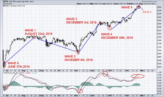
Elliott’s theory is based on the Dow theory in that stock prices move in waves. Because of the “fractal” nature of markets, I have broken them down so that you can trade a daily complete wave count. Fractals are mathematical structures, which on an ever-smaller scale infinitely repeat themselves. Elliott discovered stock-trading patterns were structured in the same way.
This week will be very interesting in the markets. You need to understand what the markets are telling you. The markets are at an “extreme”. I trade the most profitable waves, which are impulsive waves 1,3 and 5. It takes time to develop these great trades, but it is worth the wait as you observe the profits rolling in. Do not get caught up on the wrong side of the trade. Timing the waves correctly is a critical factor for creating these profitable trades.
The Corrective Waves are not as easy to identify as the Impulse Waves because the Corrective Waves have more variations as compared to the Impulse Waves. Corrective Waves of any trading pattern are broadly termed as the “ABC Corrections”. Corrective Waves are always the three wave patterns that unfold in the direction opposite of the larger trend.
“ABC Corrections” is the broad name given to the Corrective Waves. The corrective patterns formed by the Corrective Waves are against the direction of the trend. Wave 1 is corrected by the Wave 2 and Wave 3 is corrected by the Wave 4. After wave 5, the wave pattern finishes and the entire move which will be corrected. This correction will occur a multiple wave move. “ABC” numbered waves are also the Corrective Waves.
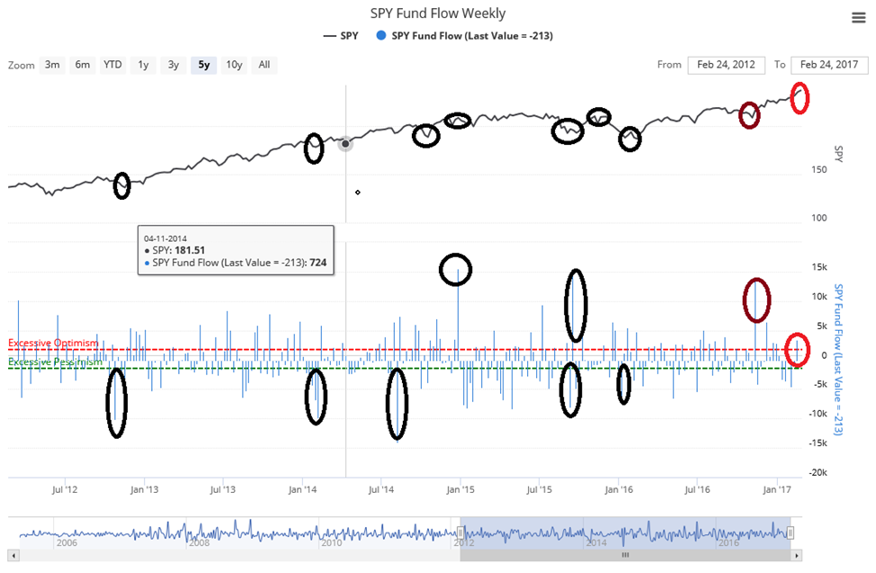
The SPY Fund Flow represents the weekly flows in and out. This is a ‘Contrary Indicator’. When it becomes extremely pessimistic, I then look for a reversal to the upside. When fund flows are very high, I become concerned about a correction as expectations may have become too optimistic.
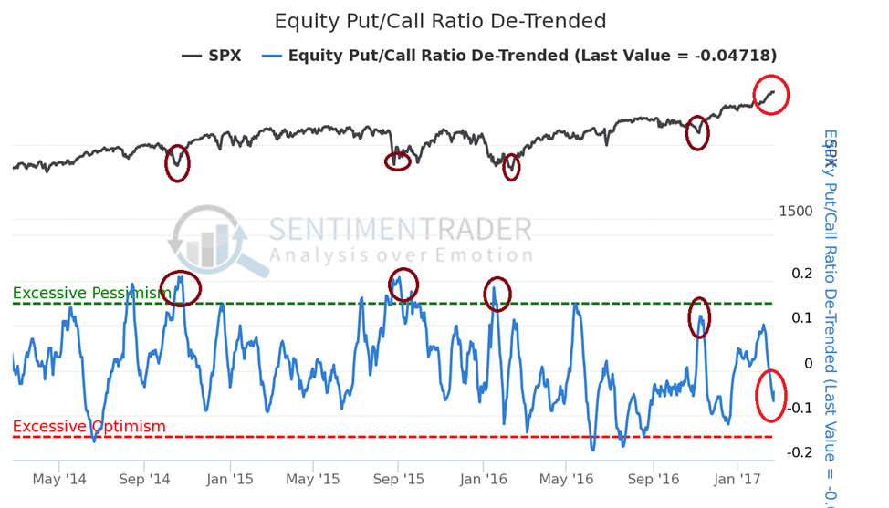
The total put/call ratio is the volume of puts divided by the volume of calls traded on individual equities on the Chicago Board Options Exchange, on any given day. Generally speaking, heavy volume in put contracts shows large-scale fear by options traders, while heavy call volume is usually a reflection of increased investor optimism in regards to rising prices. When there is heavy put buying and low call buying, the put/call ratio will be high. When an extreme is reached, this becomes a bullish contrarian indicator and we should expect higher market prices ahead of us. When option traders are optimistic and there is low put volume in relation to call volume, then the put/call ratio will be low and we may be nearing a market high. The interpretation of this indicator is the same as the equity put/call ratio itself – high readings show fear and are generally bullish for the market. Low readings, show excessive optimism as the market typically declines after they are seen.
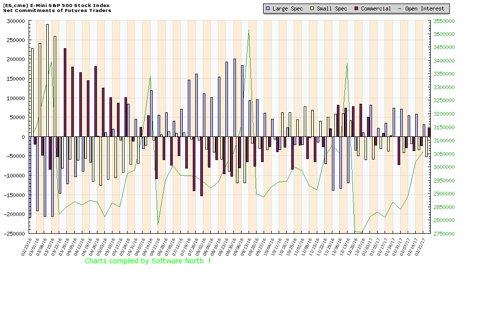
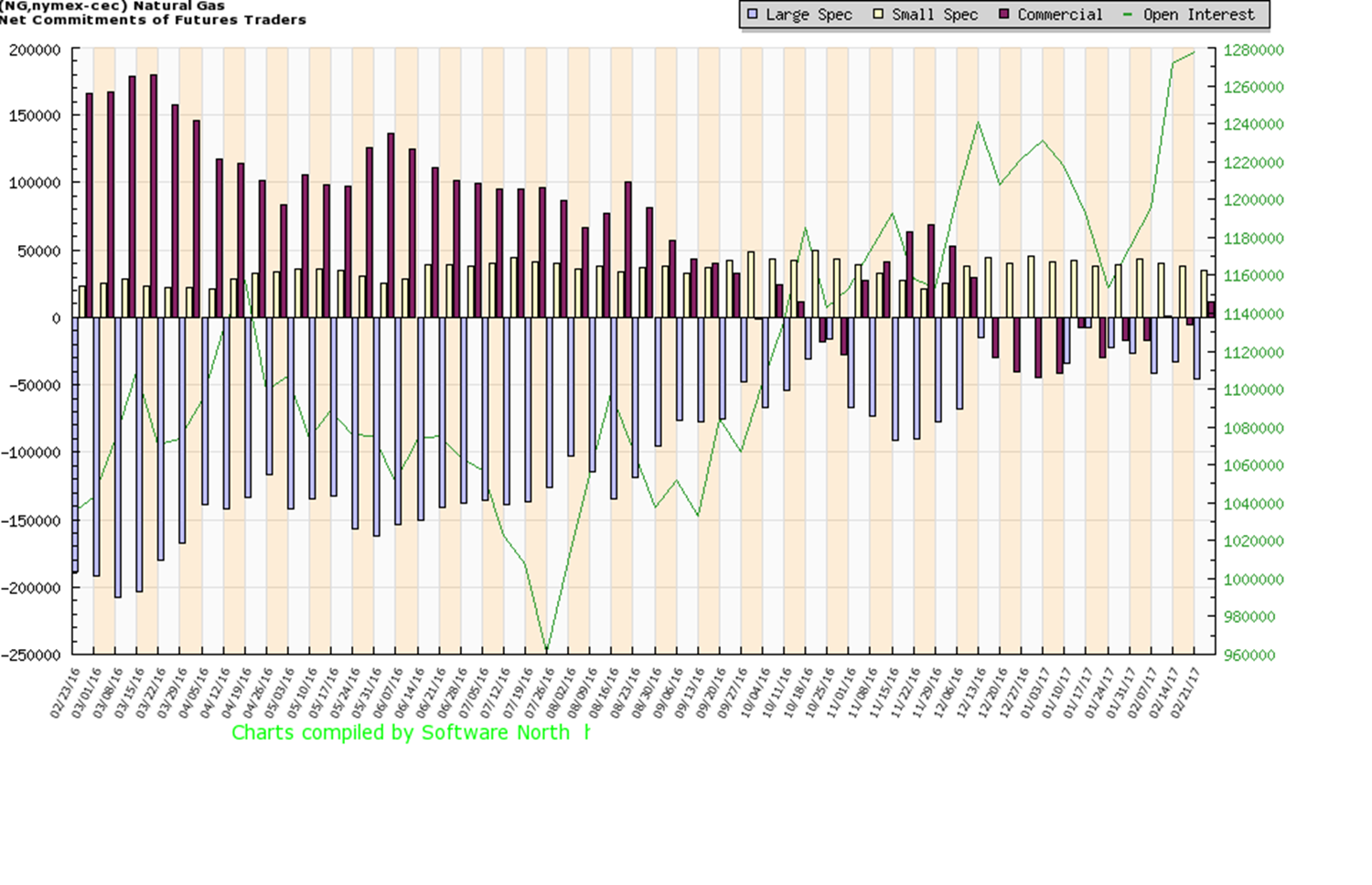
The Commitment of Traders (COT) Indicator gives you the overall picture of what is happening behind the scenes. It tells you who is buying and who is selling! This information is an important key for your trading success!
The commercial traders are considered the “Smart Money”. The chart below displays, as of February 21st, 2017, that the commercial traders have taken new long positions. This matches up perfectly with my long-term Elliot Wave forecast of 2550, in the SPX.
Red Bars: The Commercial Traders
(i.e.: Farmers, Hedgers, Producers, and Factories)
Blue Bars: The Large Speculators
(i.e.: Banks and Large Financial Money Managers)
Green Bars: The Small Speculators
(i.e.: You and me)
Yellow Line: The overall open interest in the market.
The next setup for going long on Natural Gas.
The U.S. dollar: Waiting for trend confirmation.
Learn how to build wealth during 2017!
Every week, there are new actionable trade ideas. Avoid what I refer to as “Herd Mentality” which will put you on the losing side of the trades more often than not.
Our most recent trade was UGAZ:( http://etfdb.com/etf/UGAZ/) on February 21st, 2017. We sold half of this position to lock in a quick 10+% profit in two days. Previous trades generated a 112% profit within 25 days (NUGT), and 7.7% profit (ERX) within 24 hours.
Stock Market bulls will continue their historic breakouts!
The Trump Administration’s promises of tax cuts and regulatory easing is the catalyst for the markets’ recent strong advance. Mr. David Dodd’s timeless classic saying: “The market in the short term is a voting machine, but in the long run it is a weighing machine”. This is the second most bullish market, after an election, since President Kennedy took office.
The Research Investment Committee commented “Monetary, fiscal and regulatory policies could be key drivers in 2017, but the timing of those actions could cause volatility”. New regulatory action will favor many stocks in the financial and energy sectors. Repatriation will occur under President Trump’s new corporate tax plans. The U.S. currently operates under a tax system in which the domestic earnings of U.S. corporations are taxed at the federal U.S. corporate rate (35%) and any overseas earnings that are repatriated are taxed at this rate less a credit for foreign taxes paid on those same earnings. Foreign earnings have been parked offshore, allowing corporations to avoid the taxes associated with bringing them back to the U.S. These U.S. Companies would be granted an eight-year period to pay their tax liability. President Trump’s plan calls for a one -time deemed repatriation of overseas corporate profits at a 10% tax rate.
Conclusion:
In short, the US stock market is back in full blown bull market with truck reenergizing things. While I feel a short-term correction is due any day, it is just that, a short-term pullback followed by higher prices into June/July.
https://thegoldandoilguy.com/wp-content/uploads/2016/03/forecast1-300x198.jpg198300adminhttp://www.thegoldandoilguy.com/wp-content/uploads/2014/11/tgaoglogo.pngadmin2017-02-28 10:28:562017-02-28 10:38:29Stealth ‘Bull Market’ In Stocks Still In Progress!
Subscribe to TheGoldAndOilGuy.com ETF newsletter and profit! – CLICK HERE
https://thegoldandoilguy.com/wp-content/uploads/2015/05/cvinterview.png151210adminhttp://www.thegoldandoilguy.com/wp-content/uploads/2014/11/tgaoglogo.pngadmin2017-02-15 10:12:492017-02-15 10:12:49What has been Pushing S&P 500 Higher?
Previously, I authored a “Part 1” of this article regarding my analysis of the VIX cycles. I sincerely hope my readers enjoyed the analysis and I hope it opened up a few questions regarding the potential moves in the US and global markets. Today, we will delve deeper into the concept of the VIX cycle patterns that I’ve identified and use common technical analysis concepts to attempt to identify price target levels as well as support and resistance that may become important in the immediate future.
As we had been discussing in “Part 1”, my hypothesis that a 5 month VIX cycle pattern exists and has been driving market volatility since 2015 appears to be substantiated by historical chart evidence. The other interesting facet of this 5 month pattern is that it appears to be quickening in relation to recent activity. I stated earlier that I believe this pattern to be a 18~22 week cycle event, but more recent VIX chart activity shows the current range may be more like 16~20 weeks. My understanding of cycles and patterns is that within extreme, potentially violently, volatile periods, price cycles may become more frequent and velocity may become more volatile. An example of this can be found in my long-term US major market cycle analysis below.
This image maps a major market cycle rotation process that has been in place for over 60 years. This image starts in the late 1970s and maps TOP and BOTTOM cycling events and well as potential early and late stage cycle ranges. When the GREEN and YELLOW levels, near the top, move above the 80% range, this starts the “Topping cycle event”. When both of these levels fall below the 80% range, this ends the “Topping cycle event”. The opposite is true for the BLUE and RED levels. When both of them fall below the 20% level, this starts a “Bottoming cycle event”. When they both leave the 20% level, this ends the “Bottoming cycle event”. Actual price tops and bottoms can, and often do, occur within these event ranges.
US Cycle Chart
Price and event cycles have been in place for centuries and correlate with other traditional forms of technical analysis easily. For example, Elliot Wave, Fibonacci, Price Channeling and Price Patterns all relate to cycles very well. Within this article, I’m using Price Patterns as well as Fibonacci to attempt to project and identify key target, support and resistance levels based on my understanding of the proposed VIX cycles.
Recent price expansion from the lows at $868.47, January 2016, prompted a rally to $1194.60, on April 25, 2016. This range, $326.13, represents an expansion cycle and a Fibonacci range that we can use to determine Fibonacci cycle frequency – which may help us determine future price objectives. After this peak, price dropped 25% of this range (a common Fibonacci level that is correlated to a real Fib value of 0.272) equaling $81.53. Because of this narrow retracement, we should expect a potential future price move equaling 1.272%, 1.618% or 1.768% of the existing range. XOI rallied to $1259.56 on December 12, 2016 – equating the expected 1.272% price expansion we projected and setting up for a 0.768% total range retracement.
Let’s take a look at one example – OIL (XOI)
Last week followers, subscribers and I got long 3x long energy fund – ERX.
In 24 hours we locked in a 7.7% partial profit, and are now sitting with 10+% gain on the balance. This special setup I call the Momentum Reversal Method (MRM) continues to be in play and we could experience another 20-35% gain from here.
What does all this technical stuff mean? After this bounce we should expect XOI to fall back to near $976.00 before attempting any further price moves. All of this type of Fibonacci work is conducted by understanding how Fibonacci price relationships correlate to time/price/cycle frequency functions. Many of the best analysts of the past had detailed understandings of how these correlations work and how price would react based on larger and longer term time/price/cycle events.
Stay Tuned For Gold & Silver Forecast Next – Part 3
And Join My Newsletter for Real-Time Trade Alerts!
https://thegoldandoilguy.com/wp-content/uploads/2017/02/call.png306642adminhttp://www.thegoldandoilguy.com/wp-content/uploads/2014/11/tgaoglogo.pngadmin2017-02-13 11:01:222017-02-13 11:01:22VIX Cycles set to explode in March/April 2017 – Part 2


 trades.