Traders and investors all around the world is having trouble climbing over the wall of worry/fear with the US stock market, and rightly so. There is a lot of things taking place and unfolding that carry a high level of uncertainty. Let’s face it, who wants to invest money into the market when it’s hard to come by (high unemployment, banks are still extremely tight with their money, companies are nowhere near wanting to hiring new staff).
The hard pill to swallow is the fact that the stock market loves to rise when uncertainty is high. It’s almost doing it just to drive investor’s nuts who sold out near market bottom or recent correction. You must overcome the urge to short the market when the economy looks so bearish in the years ahead, and continue to trade with the trend.
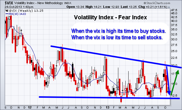
Short Term Investing – Weekly Volatility Index Chart
Below you can see the fear index. The chart is self-explanatory showing where it should move next. But if you are not familiar with the VIX then here is definition by investopedia:
“The first VIX, introduced by the CBOE in 1993, was a weighted measure of the implied volatility of eight S&P 100 at-the-money put and call options. Ten years later, it expanded to use options based on a broader index, the S&P 500, which allows for a more accurate view of investors’ expectations on future market volatility. VIX values greater than 30 are generally associated with a large amount of volatility as a result of investor fear or uncertainty, while values below 20 generally correspond to less stressful, even complacent, times in the markets.”
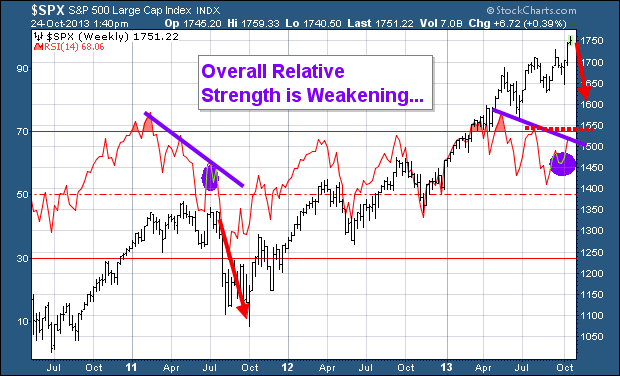
Weekly Investing Chart of the SP500 Index
After reviewing the VIX chart above which points to stocks nearing a level of selling pressure, then review the chart below we come to a conclusion that a minor pullback of 2-5% is likely to take place in the next week ortwo.
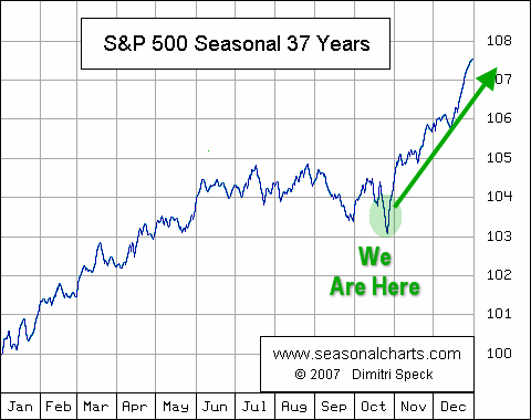
The divergence in the Relative Strength Index is a bearish sign for the broad market. While I feel a pullback is do and needed for the market to regroup, it is important to review the seasonality chart and know that we are entering one the strongest times of the year for stocks.
SP500 Seasonality Chart
Again, using the data from the previous two charts along with this graph clearly shows that a pullback in the stocks is likely going to be bought back up by the brave investors willing to override their fear and go with the trend. For more interesting charts check out my stock chartlists: https://stockcharts.com/public/1992897
The Wall Of Worry Conclusion:
In short, expect the stock market to correct in the next week or two. But once we get a correction of two percent or more, be prepared for buyers to step back in and buy things up into year end.
http://www.thegoldandoilguy.com/wp-content/uploads/2014/11/tgaoglogo.png00adminhttp://www.thegoldandoilguy.com/wp-content/uploads/2014/11/tgaoglogo.pngadmin2013-10-25 07:02:212014-03-04 13:59:26The Great American Wall Of Worry – US Stock Market
Since the middle of April everyone and including their grandmother seems to have been building a short position in the equities market and we know picking tops or bottoms fighting the major underlying trend is risky business but most individuals cannot resist.
The rush one gets trying to pick a major top or bottom is flat out exciting and that is what makes it so darn addicting and irresistible. If you have ever nailed a market top or bottom then you know just how much money can be made. That one big win naturally draws you back to keep doing it much like how a casino works. The chemicals released in the brain during these extremely exciting times are strong enough that even the most focused traders fall victim to breaking rules and trying these type of bets/trades.
So if are going to try to pick a top you better be sure the charts and odds are leaning in your favor as much as possible before starting to build a position.
Below are a few charts with my analysis and thoughts overlaid showing you some of the things I look at when thinking about a counter trend trade like picking a top within a bull market.
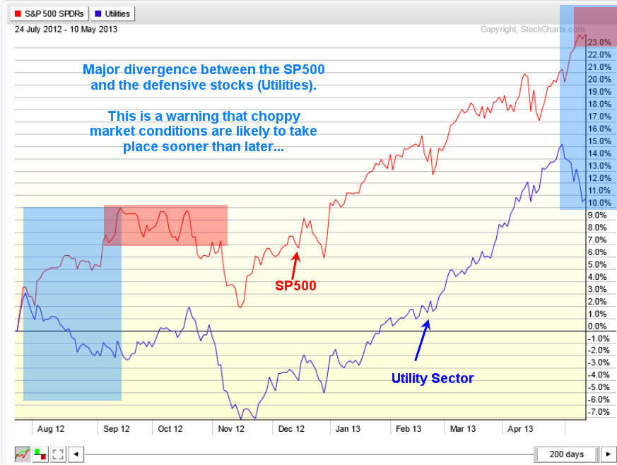
Utility Stocks vs SP500 Index Daily Performance Chart:
The SPY and XLU performance chart below clearly shows how the majority of traders move out of the slow moving defensive stocks (utilities – XLU) and starts to put their money into more risky stocks. This helps boost the broad market. I see the same thing in bonds and gold this month which is a sign that a market top is nearing.
That being said when a market tops it is generally a process which takes time. Most traders think tops area one day event but most of the times it takes weeks to unfold as the upward momentum slows and the big smart money players slowly hand off their long positions to the greedy emotion drove traders.
Look at the chart below and notice the first red box during September and October. As you can see it took nearly 6 weeks for that top to form before actually falling off. That same thing could easily happen again this time, though I do feel it will be more violent this time around.
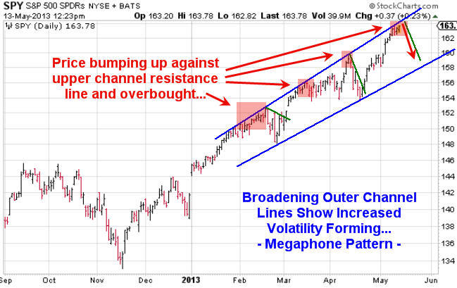
SPY ETF Trading Chart Shows Instability and Resistance:
Using simple trend line analysis we see the equities market is trading at resistance and sideways or lower prices are more likely in the next week or two.
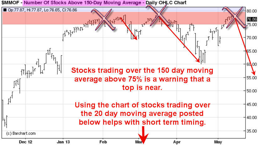
Stocks Trading Above 150 Day Moving Average Chart:
This chart because it’s based on a very long term moving average (150sma) is a slow mover and does not work well for timing traded. But with that said it does clearly warn you when stocks are getting a little overpriced and sellers could start at any time.
General rule is not to invest money on the long side when this chart is above the 75% level. Rather wait for a pullback below it.
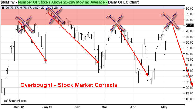
Stocks Trading Above 20 Day Moving Average Chart:
This chart is based on the 20 day moving average which moves quickly. Because it reacts quicker to recent price action it can be a great help in timing an entry point for a market top or bottom. It does not pin point the day/top it does give you a one or two week window of when price should start to correct. You can view this chart below live but without my analysis here: http://www.thetechnicaltraders.com/stock-market-momentum/
How to Spot and Time Stock Market Tops Conclusion:
As we all know or will soon find out, trading is one of the toughest businesses or and one of the most expensive hobbies that one will try to master. Hence the 95-99% failure rate of individuals who try to understand how the market functions, position management, how to control their own emotions and to create/follow a winning strategy.
With over 8000 public traded stocks, exchange traded funds, options, bonds, commodities, futures, forex, currencies etc… to pick from its easy to get overwhelmed and just start doing more or less random trades without a proven, documented rule based strategy. This type of trading results in frustration, loss of money and the eventual closure of a trading account. During this process most individuals will also lose friends, family and in many cased self-confidence.
So the next time you think about betting against the trend to pick a top or a bottom you better make darn sure you have waited well beyond the first day you feel like the market is topping out. Stocks trading over the 150 and 20 day moving averages should be in the upper reversal zones and money should be flowing out of bonds and other safe haven/defensive stocks to fuel the last rally/surge higher in the broad market.
Also I would like to note that I do follow the index futures and volume very closely on both the intraday and daily charts. This is where the big money does a lot of trading. Knowing when futures contracts are being sold or bought with heavy volume is very important data in helping time tops and bottoms more accurately. And the more experience you have in trading also plays a large part in your success in trading tops and bottoms.
http://www.thegoldandoilguy.com/wp-content/uploads/2014/11/tgaoglogo.png00adminhttp://www.thegoldandoilguy.com/wp-content/uploads/2014/11/tgaoglogo.pngadmin2013-05-13 19:34:152014-03-06 11:29:07How to Spot & Time Stock Market Tops
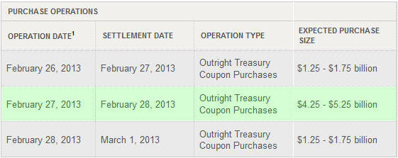
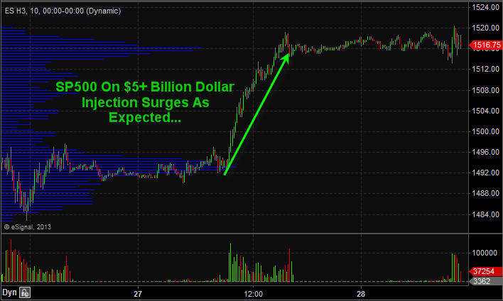
This week I talked about how the uptrend is to be the focus of trading positions until a down trend is actually confirmed via price and volume action. The SP500 was very close to reversing down this week but with the POMO’s (permanent open market operations) scheduled largest injection of money for February of over $5 billion dollars sent stocks soaring jamming stocks back up into its uptrend.
Take a look at the normal daily injections and then look at Feb 27th’s….
SP500 Futures 10 Minute Chart Zoomed Back 48 Hours…
SP500 Trend – Green, Orange, Red candles indicate trend direction
Short Term Trading Conclusion:
Following the bigger underlying trend of the market along with the big money will keep you on the right side of the market more times than not. My trading strategy which is now programmed into my trading system clearly tells me the current market trend, entry signals, profit taking, stop adjustments and exit prices.
Creating a proven trading strategy which works in all market conditions and having it programmed to do 95% of the analysis for you keep my trading emotions in check, saves me time and money and keeps things simple which is the key for long term success. So keep your eye on the POMO’s injection schedule each month for days to focus on long day trades or entry points for swing trades.
“I believe that banking institutions are more dangerous to our liberties than standing armies. If the American people ever allow private banks to control the issue of their currency, first by inflation, then by deflation, the banks and corporations that will grow up around [the banks] will deprive the people of all property until their children wake-up homeless on the continent their fathers conquered. The issuing power should be taken from the banks and restored to the people, to whom it properly belongs.”
~ Thomas Jefferson ~
Well here we are, caught between resistance in the S&P 500 around the 1,330 area and support around the 1,300 price level. My last two articles have discussed why I was expecting a top in the coming days and weeks ahead, but prices just continued to work higher.
One of the things that I pride myself in as a person who trades and writes about financial markets in public is that I am always honest. If I blow a call I fess up and admit it. When I have made mistakes in the past, I always try to learn something new from them and I discuss losing trades publicly with readers and members of my service.
This time is different. I honestly do not know if I am going to be right or wrong. The price action in the S&P 500 Thursday was certainly bearish short term, but a back test of 1,300 or possibly even 1,280 could give rise to a Phoenix. Granted, the Phoenix is nothing more than Ben Bernanke’s pet, but that is a topic for a different time.
I have scanned through my list of indicators which discuss sentiment based on momentum, put/call ratio, the advance/decline line, Bullish Percent Indicators, and several ratio based indicators and they are all SCREAMING that a top is near. The interesting thing about the previous statement is that it would have been true a week ago and mostly true two weeks ago, yet prices have continued to climb.
The daily chart of the S&P 500 Index demonstrates the recent price action that has continued to climb the “Wall of Worry” for several weeks:
S&P 500 Daily Chart
The culmination of the massive run higher for the S&P 500 was the dovish comments coming from Ben Bernanke during Wednesday’s press release and press conference.
The U.S. & European Central Banks are seemingly in a perpetual race to debase their underlying fiat currencies. The race will not end well. In fact, this type of situation smells like a Ponzi scheme where Ben Bernanke and Mario Draghi (ECB President) are the wizards behind the curtains. Their loose monetary policies and forced reflation are synthetic drugs that juice risk assets higher and ultimately Mr. Market will have his vengeance in due time.
At this point, it seems like Ben Bernanke will do anything to juice equity prices higher. I think his hope is that they will be able to artificially keep the game going until the recovery is on a more sound footing. However, when the entire recovery is predicated on cheap money and liquidity and is not supported by organic economic growth it just prolongs the inevitable disaster.
As an example, the daily chart of the Dow Jones Industrial Average is shown below. I would point out that that Dow came within 35 points (0.27%) from testing the 2011 highs. Furthermore, the Thursday high for the Dow was only 1,356 points (10.55%) from reaching the all-time 2007 October high.
Dow Jones Industrial Average Daily Chart
I have argued for quite some time that the economy and the stock market are two different things. If Bernanke and his cronies succeed in reflating the financial markets and the Dow reaches its October 2007 high in the near term, more retail investors will regard equity markets as being rigged.
Who could blame them for viewing financial markets as a giant rigged casino that stands to win while they continue to lose their hard earned capital? We all recognize that the current economy is nowhere near as strong as it was in 2007. But alas, the regular retail investor does not recognize that the stock market and the economy do not portray the same meaning.
One specific underlying catalyst that has gone largely unnoticed by most of the financial media during this sharp run higher in stocks is the total lack of volume associated with the march higher. The NYSE volume over the past 2 months has been putrid when compared to historical norms.
As a trader, I am forced to take risk through a variety of trade structures. However, the idea that a crash could be coming seems hard pressed as long as Big Bad Ben is at the wheel.
If the Russell 2000 drops 10%, I am convinced that Ben will be out making announcements that the Fed stands ready to intervene with all of the supposed tools they have at their disposal. Let’s be honest here, they really have one tool comprised of 3 separate functions which are all a mechanism to increase liquidity in the overall system. To express this liquidity, the following chart from the Federal Reserve shows the M2 money supply levels:
Current M2 Money Supply
The 3 functions are the printing of currency, the monetization of U.S. Treasury debt (QE, QE2, QE2.5, Operation Twist), and exceptionally low interest rates (ZIRP) near 0 for an “extended period of time (2014).” Since monetary easing is all that the Federal Reserve has done since the financial crisis began, it begs to reason that the Federal Reserve has no other solutions or tools available. If they did, they seemingly would have used them by now.
The first bubble they created due to loose monetary policy was the massive bubble in oil in 2008. Fast forward to the present, and they are currently supporting another bubble in U.S. Treasury obligations. The bubble that they will create in the future when the game finally ends will be in precious metals. The precious metals bubble will be building while the Federal Reserve and the U.S. Treasury attempt to keep the Treasury Bond bubble from bursting.
At this point in time, if we continue down this path stocks will not protect investors adequately from inflation should the Treasury bubble burst. I would argue that the central planning and monetary policy we have seen the past few years continues in the United States and Europe that gold, silver, and other precious metals are likely to begin their own bubble of potentially epic proportions.
As the weekly chart of gold futures illustrates below, gold has recently pulled back sharply and has broken out. I will likely be looking for any pullbacks in gold as buying opportunities as long as support holds.
Gold Weekly Chart
In closing, for longer term investors the stock market might have some serious short term juice as cheap money and artificially low interest rates should juice returns. However, eventually equities will start to underperform. At that point, gold will be in the final stages of its bubble and the term parabolic could likely be applied.
If central banks around the world continue to print money there are only a few places to hide. Precious metals and other commodities like oil will vastly outperform stocks in the long run if the Dollar continues to slide. The real question we should be asking is who will win the race to debase, Draghi or Bernanke?
http://www.thegoldandoilguy.com/wp-content/uploads/2014/11/tgaoglogo.png00adminhttp://www.thegoldandoilguy.com/wp-content/uploads/2014/11/tgaoglogo.pngadmin2012-01-30 12:24:132014-03-06 12:26:42Why Gold Is Shining Bright & What the Fed is Doing
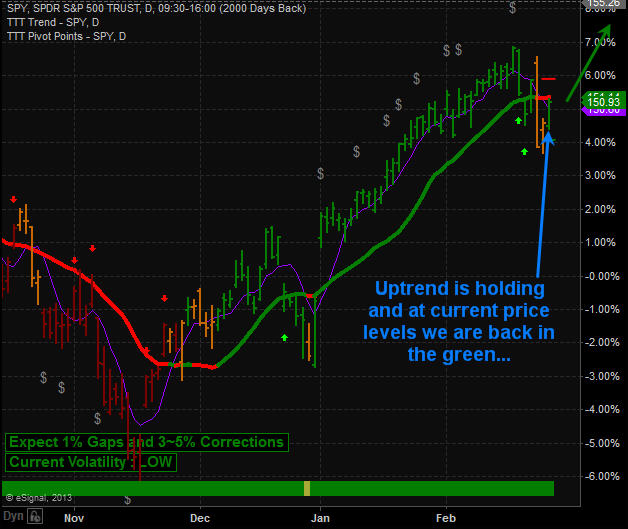
Last week was volatile thanks to China raising their interest rates a quarter basis point. This rate hike caused the Dollar to spike in value which in turn forced equities and metals to sell off sharply. This one day event caused equities to break below a short term support level causing a large number of protective stops to be triggered. This added more selling pressure causing the market to be down nearly 2.5% at one point but a late day bounce recouped a good chunk of the drop.
Wednesday & Thursday the market had a nice rally making back all of losses and then some. But Thursday afternoon we saw the market slip below a key short term support level and triggered another wave of stops. The market continues to resilience because it recovered into the close saving the day.
After Thursday’s end of day rally, we had expected a typical light volume session which typically chops around in a sideways or slow grind higher.
SPY – SP500 ETF 10 Minute Intraday Chart
I have put together a short video covering last weeks price action along with that I feel is likely to unfold this week.
http://www.thegoldandoilguy.com/wp-content/uploads/2014/11/tgaoglogo.png00adminhttp://www.thegoldandoilguy.com/wp-content/uploads/2014/11/tgaoglogo.pngadmin2010-10-24 19:47:542014-03-10 08:59:54Weekend SPX, Dollar, Oil and Gold Analysis and Video
The market continues to whipsaw traders out of positions as volatility rises. I have put together a few charts to show you where each of our commodities are trading along with the SPX (SP500 index).
My Gold Stock Breakout Model – Monthly Chart
I use this chart to keep my big picture trades on the right side of gold. I found that gold stocks tend to lead the price of gold so watching this gold stock index on the monthly, weekly and daily charts can provide me with short term tops and bottoms for trading gold bullion, GLD or DGP exchange traded funds.
The monthly chart clearly shows the rally in stocks has now sold back down to my resistance trend line. If we do not get a rally this week in gold stocks, then I think we could see gold trade sideways or down for several months.
HUI Gold Stock Newsletter
GLD Gold ETF Trading Fund – Newsletter
The daily gold bullion fund shows the recent price action and what I think could happen in the coming weeks. In the past couple days gold has moved to a short term support level where I think we could see buyers step in.
We took some profits near the high and continue to hold a core position until we have another technical breakdown or new setup to add more to the position again.
GLD Gold ETF Trading Newsletter
SLV Silver ETF Trading Fund – Newsletter
Silver is in the same boat as gold. We have taken some profits and are still holding a core position with protective stops in place just incase the market does head lower from here.
Silver SLV ETF Trading Newsletter
USO Crude Oil Trading Fund – Newsletter
Crude oil started to bleed lower last week as the price sliced through the multi month support trend line. Volume shot up as stop orders get triggered on the way down. We finally have a move outside of the pennant formation that has been in place for several months. Now we can start looking for a low risk setup for trading crude oil again.
Crude Oil USO Trading Newsletter
UNG Natural Gas Trading Fund – Newsletter
Natural gas has really come back to life. I mentioned on September 2nd that natural gas (UNG) looked like a buy between $9 – $9.50 and it has now rallied 25% since that point. But stepping back and looking at the chart we can see resistance is hovering over head between the $12 – $12.25.
I may send out a setup for a short play if we get one but I feel the heavy sell off in August was the final wave down, flushing out traders. Speculative traders seem to have moved into natural gas and I think they will continue to buy it for some time. Pullbacks will be sharp but most likely followed with more buying as we enter the cooler months of the year.
Natural Gas UNG Trading Newsletter
SPX Index Trading – Active Trading Partners
I thought that I would show a quick picture of the SPX because it shows the psychology of traders and how it repeats it’s self over and over. The black and green waves are virtually the same patterns.
I feel as though the market is ready for a larger pullback than what we had in June/July but my focus will be to buy in the oversold dips and lighten my positions in overbought conditions (scaling in and out of positions) until the trend confirms it has reversed.
SPX SP500 Trading Newsletter
My Market Trading Newsletter Conclusion:
Gold stocks are pulling back and precious metals continue to move with the overall market action. I do feel that gold and silver will break this relationship and start to move higher in the coming months but until that happens I remain cautious with my positions tightening my stops.
Crude oil is starting to come alive and I am now looking for some low risk setups for energy related funds. Last week’s technical breakdown could provide us with a big move in the coming months.
Natural Gas continues to hold up but is now trading near resistance. Depending how many spec traders there are still lingering around (as most lost their shirts in the recent months), will dictate how much higher natural gas will move. The 25-30% rally in the past month has been very powerful and this could be just the beginning. I am now waiting for another setup that could be a long or a short trade depending on what happens next.