Posts

If you pay attention to the trends taking place on the Weekly Bitcoin chart, you’ll notice that it has reacted to the global market Covid-19 trends almost exclusively since the beginning of 2020.  After the end of 2019, the US stock market rallied on Q4: 2019 data and so did Bitcoin.  The US Stock market peaked near February 20 and began a deeper selloff on February 25 – Bitcoin followed this pattern as well.  When the US Fed initiated the stimulus on March 23, Bitcoin prices had already started to bottom in anticipation of the Fed stimulus and really began to rally after the Fed began intervening.

Before you continue, be sure to opt-in to our free market trend signals
before closing this page, so you don’t miss our next special report!

BITCOIN VS S&P 500 DAILY CHART COMPARISON

This is a bit unusual for Bitcoin, which in the past didn’t correlate to the US stock market trends all that well.  What changed?  We believe the sudden correlation of Bitcoin to the US Stock Market trends are related to investor psychology and the perceived efforts of the Central Banks in supporting the global economy.

We find it interesting that a decentralized cryptocurrency, which is supposed to be independent of global central banks and governments, suddenly aligns almost perfectly with the US stock market in correlation with the US Federal Reserve.  It is almost as if Bitcoin prices are much more aligned with the global economy and global central banks as this crisis event unfolds.  This suggests the true value of Bitcoin is not as an alternate, decentralized currency.  The true value of Bitcoin is a hyper-speculative alternate store of value – unrelated to any real asset or oversight process.

WHAT’S NEXT FOR BITCOIN – WEEKLY CHART

If our research is correct, the current downside price channel (Resistance) originating from the June 2019 highs will prompt a massive breakdown in price over the next 5+ weeks – possibly longer.  There are two key factors that lead us to this conclusion.  First, the correlation to the US stock market, which we believe will continue to move lower until an ultimate bottom is reached near July or August 2020.  Second, the massive Fibonacci Price Amplitude Arc inflection point (the GREEN ARC) which will be reached in less than seven days.

If Bitcoin continues to mirror the US stock market price action and this inflection point does what we believe, then a massive breakdown in price may start to trend sometime between May 8 and May 14.

DAILY BITCOIN CHART

This Daily Bitcoin Chart shows you what we believe to be the most likely outcome going forward.  A bit of upward price rotation to potentially retest the resistance level, then a moderate selloff, followed by a brief sideways trend before an even deeper selloff begins.  This may be a map of what the US stock market may do over the exact same span of time.

CONCLUDING THOUGHTS:

Our researchers believe the ultimate bottom will set up near the end of Q3: 2020.  We believe general weakness will push the US stock market price towards an ultimate low/bottom near July or August 2020.  After that bottom completes, Q4: 2020 may see a moderate upside price trend as the Santa Rally mode kicks in.  If Bitcoin mirrors this move, then it may attempt to move below the $3850 level and ultimately attempt to find a bottom below $3000.

Our researchers believe Bitcoin has recently aligned with the US stock market and the global central banks.  If this is the case, then the “alternate decentralized currency” aspect of cryptos becomes a useless component of the market.  If Bitcoin mirrors the SPY going forward, then it is just an expensive, highly volatile alternate measure of the US stock market and global central bank activities.

Watch for the price breakdown near May 10th or so.

As a technical analyst and trader since 1997, I have been through a few bull/bear market cycles in stocks and commodities. I believe I have a good pulse on the market and timing key turning points for investing and short-term swing traders. 2020 is an incredible year for traders and investors.  Don’t miss all the incredible trends and trade setups.

Subscribers of my Active ETF Swing Trading Newsletter had our trading accounts close at a new high watermark. We not only exited the equities market as it started to roll over in February, but we profited from the sell-off in a very controlled way with TLT bonds for a 20% gain. This week we closed out SPY ETF trade taking advantage of this bounce and entered a new trade with our account is at another all-time high value.

Ride my coattails as I navigate these financial markets and build wealth while others watch most of their retirement funds drop 35-65% during the rest of this financial crisis going into late 2020 and early 2021.

Just think of this for a minute. While most of us have active trading accounts, what is even more important are our long-term investment and retirement accounts. Why? Because they are, in most cases, our largest store of wealth other than our homes, and if they are not protected during the next bear market, you could lose 25-50% or more of your net worth. The good news is we can preserve and even grow our long term capital when things get ugly like they are now and ill show you how and one of the best trades is one your financial advisor will never let you do because they do not make money from the trade/position.

If you have any type of retirement account and are looking for signals when to own equities, bonds, or cash, be sure to become a member of my Passive Long-Term ETF Investing Signals which we issued a new signal for subscribers.

Chris Vermeulen
Chief Market Strategies
Founder of Technical Traders Ltd.

Our research team has put together these charts of our ADL modeling system (Advanced Dynamic Learning), which shows a very clear upside price recovery starting to take place in late September or early October of this year. The ADL system also suggests the recovery may last through most of Q4:2020 before the markets collapse again in early 2021.

This predictive modeling system has become somewhat of a hit with our members and our followers.  We continue to get requests from members for selected ADL research related to Oil, the NASDAQ, or other symbols. The idea that we can attempt to see into the future with a certain degree of accuracy would certainly appeal to any trader/investor.

These updated ADL charts show that the US stock market may stay under some downward/sideways pricing pressure until last September 2020 – prompting a Q4 “Santa Rally”, before the markets appear to find a new extreme weakness in early 2021.  This suggests a brief uptick in consumer activity and economic engagement centered around the November 2020 elections and the 2020 Christmas Holiday season, then back to a more contracted economic mode in early 2021.

Before you continue, be sure to opt-in to our free market trend signals
before closing this page, so you don’t miss our next special report!

YM MONTHLY CHART

This YM Monthly chart highlights our ADL predictive modeling system’s results from a September 2019 origination point.  The one thing we want to add about the ADL system and the current Covid-19 virus event is that our ADL system attempts to map historic price activity into “DNA markers” and uses those DNA markers to attempt to identify and predict future price activity.  Obviously, there has been nothing like the Covid-19 virus event in recent history.  Thus, the ADL predictive modeling system is attempting to apply price DNA to an event that is unprecedented in 80+ years of price history.

Our researchers believe the ADL system will be able to pick up inherent price rotations and trends that relate to existing price DNA markers, yet the scale and scope of the price moves related to the current Covid-19 event may be much larger and more volatile than the ADL predictive modeling system is capable of indicating.  For example, take a look at the YM chart below and realize that price moved well beyond the ADL predictive price markers on this chart.  This is not an anomaly in price, this is an extreme moment in time that the ADL predictive modeling system is incapable of modeling accurately.

Thus, as we are showing you the ADL predictive modeling results, remember that extreme volatility related to the global market event could push the price 6% to 15% further away from these predicted price levels very easily as volatility increases.  Thus, a bottom shown on this chart near 24,000 with the ADL system could actually result in a price bottom near 22.460 or 20,400 (6% to 15% below the projected price level).

MONTHLY NQ CHART

This Monthly NQ chart shows that the tech-heavy NASDAQ may provide a more stable sideways market rotation over the next 6+ months than the S&P500 or the Dow Industrials.  The ADL system is suggesting that the NQ will likely move lower over the next 3+ months before recovering back to the 9,000 price range in September/October 2020.  Again, we see moderate weakness in price in early 2021 for a short period of time before price attempts to resettle near 9,200 in Q2:2021

This suggests the NASDAQ will continue to attract foreign investment and show more restrained price volatility than the Dow or the S&P.  Again, pay attention to the extreme volatility in the markets and how the price has extended 5% to 15%+ beyond the ADL predictive price levels.  Until the volatility subsides, continue to expect this extreme price rage volatility.

Our ADL system accurately predicted the month gold started a new bull market last year which Eric Sprott talked about. Also, we predicted the month oil was going to crash. while price hit our downside target correctly the price went way beyond that as we all know.

CONCLUDING THOUGHTS:

Overall, it appears September/October of 2020 is setting up for a moderate US stock market price recovery. Until then, it appears we have a bit of additional price rotation and volatility to contend with.  The interesting take-away from all of this is that our original expectation for a price bottom near or after June or July 2020 seems very accurate.

Technical traders should wait for the price to confirm these predictions before taking any actions.  This is a great market for skilled short term traders to find opportunities.  But it is also very dangerous for traders to chase trends.

The next few years are going to be full of incredible opportunities for skilled traders and investors.  Huge price swings, incredible revaluation events, and, eventually, an incredible upside rally will start again.

I’ve been trading since 1997 and I’ve lived through numerous market events.  The one thing I teach my members is that risk is always a big part of trading and that’s why I structure all of my research and trading signals around “finding profits while reducing overall risks”.  Sure, there are fast profits to be made in these wild market swings, but those types of trades are extremely risky for most people – and I don’t know of anyone that wants to risk 50 or 60% of their assets on a few wild trades.

I’m offering you the chance to learn to profit, as I do with my own money, from market trends that I hand-pick for my own trading.  These are not wild, crazy trades – these are simple, effective, and slower types of trades that consistently build wealth.  I issue about 4 to 8+ trades a month for my members and adjust trade allocation based on my proprietary allocation algo – the objective is to gain profits while managing overall risks.

You don’t have to spend days or weeks trying to learn my system.  You don’t have to try to learn to make these decisions on your own or follow the markets 24/7 – I do that for you.  All you have to do is follow my research and trading signals and start benefiting from my research and trades.  My new mobile app makes it simple – download the app, sign in and everything is delivered to your phone, tablet, or desktop.

I offer membership services for active traders, long-term investors, and wealth/asset managers.  Each of these services is driven by my own experience and my proprietary trading systems and modeling systems.  I have a small team of dedicated researchers and developers that do nothing but research and find trading signals for my members.  Our objective is to help you protect and grow your wealth.

Please take a moment to visit www.TheTechnicalTraders.com to learn more.  I can’t say it any better than this…  I want to help you create success while helping you protect and preserve your wealth – it’s that simple.

Chris Vermeulen
Chief Market Strategist
Technical Traders Ltd.

Recently, the Transportation Index and the S&P SPDR ETF setup topping patterns near the end of April 2020.  In terms of technical triggers, these patterns need to see additional downside price confirmation before we can confirm the true potential for these setups. If they do confirm, we could be starting a new downside price trend fairly soon.

The recent market upside price move is dramatically different on the TRAN chart vs. the SPY chart.  Even though the SPY price advance has mirrored the move in the ES and NQ, the TRAN upside price move has been more muted.  This is because global economic activity has continued to stall and is not translating into active shipping and trucking activity.  Remember, the Transportation Index helps us to understand the core levels of economic activity as parcels and products move around the globe.

Initially, the downside price break that occurred on Friday, May 1, 2020, which acts as a potential new downside price trend, yet we would want to see the recent lows from 8 days ago breached before we could consider this a truly confirmed trend.  Technical traders may choose how and when to enter new trades/trends – yet we like to teach our followers to wait for true confirmation. I posted a short video about how I analyze the index for new trades here.

TRANSPORTATION INDEX (TRAN) DAILY CHART

On the TRAN chart, the recent lows near 7,762 would qualify as a breakdown price move.  Thus, if the TRAN sells off below that level, then we would have a confirmed downside price trend expecting 6,500 to be reached again.

SPY DAILY CHART

On this SPY chart, a similar type of Three River Evening pattern setup a nearly perfect top over the past four days.  A confirmation appears to be valid on Friday, May 1, 2020.  Yet, we would need to wait to see if the low price level near 272 is breached before we could confirm a true breakdown in this upward price trend.


Skilled traders should pay very close attention to what happens over the next five or more trading days as any new breakdown in price could be very volatile and aggressive.  Our researchers believe the 251.50 level on the SPY would be the next downside target (see the YELLOW ARROW on this chart).

The heavy GREEN Arcing line near the recent peak is our proprietary Fibonacci Price Amplitude Arc representing a very key resistance level (1.618x).  Notice how this level played a very key role in providing initial support in early March and is now acting as a major top/resistance area.

We could be in for a very big ride if a new breakdown begins soon.

SPY WEEKLY CHART – REVERSAL CANDLE

This 35% bounce in the SP500 I called many weeks showing how this very similar setup unfolded during the 2000 market top.

2000 STOCK MARKET TOP & BEAR MARKET THAT FOLLOWED

The chart may look a little overwhelming, but look at each part and compare it to the market psychology chart above. What happened in 2000 is what I feel is happening this year with the stock market sell-off.

In 2000, all market participants learned of at the same time was that there were no earnings coming from their darling .com stocks. Knowing they were not going to make money for a long time, everyone started selling these terrible stocks, and the market collapsed 40% very quickly.

What is similar between 2000 and 2020? Simple really. COVID-19 virus has halted a huge portion of business activity, travel, purchases, sporting events, etc. Everyone knows earnings are going to be poor, and many companies are going to go bankrupt. It is blatantly clear to everyone this is bad and will be for at least 6-12 months in corporate earnings; therefore, everyone is in a rush to sell their stock shares and are in a panic to unload them before everyone does.

Before you continue, be sure to opt-in to our free market trend signals
before closing this page, so you don’t miss our next special report!

2020 STOCK MARKET TOP IS UNFOLDING

As you can see, this chart below of this year’s market crash is VERY similar to that of 2000 thus far, it’s based on a similar mindset.

I posted this chart originally mid-March, expecting a 30+% rally from these lows before the market starts to fall and continue the new bear market, which I believe we are entering. Only the price will confirm the direction and major trend to follow, and since we follow price action and do not pick tops or bottoms, all we have to do is watch, learn, and trade when price favors new low-risk, high reward trade setups.

It does not matter which way the market crashes from here, we will either profit from the next leg down, or will miss/avoid it depending on if we get a tradable setup. Either cause is a win, just one makes money, while the worst-case scenario just preserves capital in a cash position, you can’t complain either way if you ask me.

I have issued an Important Trade and Investment Alert here because a new bear market is potentially just around the corner.

CONCLUDING THOUGHTS:

As a technical analyst and trader since 1997, I have been through a few bull/bear market cycles in stocks and commodities. I believe I have a good pulse on the market and timing key turning points for investing and short-term swing traders. 2020 is an incredible year for traders and investors.  Don’t miss all the incredible trends and trade setups.

Subscribers of my Active ETF Swing Trading Newsletter had our trading accounts close at a new high watermark. We not only exited the equities market as it started to roll over in February, but we profited from the sell-off in a very controlled way with TLT bonds for a 20% gain. This week we closed out SPY ETF trade taking advantage of this bounce and entered a new trade with our account is at another all-time high value.

Ride my coattails as I navigate these financial markets and build wealth while others watch most of their retirement funds drop 35-65% during the next financial crisis.

Just think of this for a minute. While most of us have active trading accounts, what is even more important are our long-term investment and retirement accounts. Why? Because they are, in most cases, our largest store of wealth other than our homes, and if they are not protected during the next bear market, you could lose 25-50% or more of your net worth. The good news is we can preserve and even grow our long term capital when things get ugly like they are now and ill show you how and one of the best trades is one your financial advisor will never let you do because they do not make money from the trade/position.

If you have any type of retirement account and are looking for signals when to own equities, bonds, or cash, be sure to become a member of my Passive Long-Term ETF Investing Signals which we issued a new signal for subscribers.

Chris Vermeulen
Chief Market Strategies
Founder of Technical Traders Ltd.

Most traders just don’t have the time to track the market on an intraday basis. Crazy thing is I found a way that takes advantage of the intraday price action ever needing to look at a single intraday chart. Now we can swing trade using the daily charts but get the added performance of watching the intraday chart price action. What also makes this strategy exciting is that it works with virtually any time frame, thought each time frame and investment vehicle will require its own custom settings in order to track properly.

I call this strategy a Momentum Trend Crossover. It’s based on 2 moving averages that use intraday day, or intra-bar price action to calculate its value. And a Donchian channel to track recent highs/lows for protective stop placement.

Below are three charts showing how it looks and works.

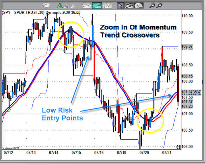
Close Up Of Momentum Crossovers – 30 Minute Chart

The chart below clearly shows how the two average track very closely to another. They both have slight variations in how they calculate their value. In short, when the blue moving average crosses below the red the market is in distribution mode (down trend/sell bounces). And it’s the opposite for when the blue trend line crosses above the red which is accumulation mode (up trend/buy dips).

The Donchian channel is used for entry and protective stops. This indicator has three parts, the upper, middle and lower bands. It tracks the most recent highs and lows providing clear protective stop levels for each trend.

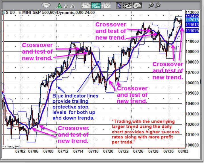
60 Minute Chart – Moving Average Trend Trading Chart

This is an example of a 60 minute chart which I find very helpful in catching decent size trades. As you can see when the moving averages crossover the market reverses direction. The really cool thing about this is that there is almost zero lag in this indicator. Many times the cross over happens before the price starts to drop.

For best results I always make sure the next larger time frame is in favor of the trade I am looking to take. Doing this increased the probability that more trades will become profitable.

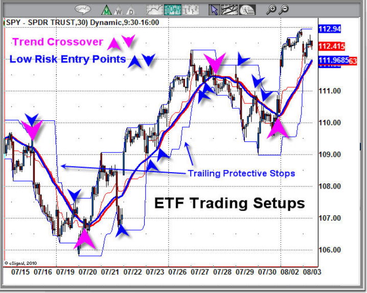
30 Minute Chart – Short Term Trend Trading

This chart shows key reversals and low risk entry points using the Donchian channel and moving average price levels. I know these are intraday charts I am showing you but it can be used with daily weekly and monthly charts also. The intraday charts really show it in action and how choppy market conditions can be filtered to be smooth.

Momentum Trend Crossover Benefits:
• Can be applied to any investment vehicle – Stocks, ETFs, Futures, Currencies
• Customizable to work with any time frame
• The trend is your friend and this always keeps you inline with the trend.
• Eliminates the noise in the market during choppy conditions
• Reduces emotions because you instantly can see when to enter and exit positions

My Thoughts On This Trading Model

I have never been a fan of Moving averages because they lag the market so much. Over the years watching intraday price action in conjunction with the daily chart I found a way to make the moving averages carry over the intraday strength/weakness which in turn gives us an almost real-time, if not early signal about a trend change.

This is one of the strategies I use within my trading newsletters to help generate low risk trading signals. Takes some of the guess work out of trading, that’s for sure!

If you would like to get my trading alerts and learn more about this, please go to www.TheGoldAndOilGuy.com to see what I have to offer.

Chris Vermeulen

GET MY FREE WEEKLY TRADING REPORTS DIRECTLY IN YOUR INBOX