Global Central Banks Move To Keep The Party Rolling – Part III
This section of our multi-part article regarding current and past central bank actions, we are going to attempt to look at key elements of the past and present to highlight what we believe may turn out to be an incredible “setup” in the global markets.
This setup is almost like a complex chess game where two skilled players battle for control and near the end of the game, one player is left with the King, a Rook, and a Pawn while the other player has a dramatic advantage with stronger chess pieces. Yet, as the game continues, the weaker player is able to remove one or two of the stronger players key pieces and move his pawn to his opponent’s side to recover his Queen – thus altering the dynamic of the game and eventually winning.
This actually happened to me once playing against a friend of mine. My friend was so wrapped up in trying to move my King into checkmate, he left his other pieces open for me to target and remove – while leaving my Pawn untouched. After I had gained a clear advantage by removing his stronger pieces, I cornered his king within an area that allowed me to move my Pawn to his side of the board whereas I regained my Queen. At that point, the game was nearly over for him – and he knew it.
Did the US Fed and global central banks set up a similar type of process in the global economy? We can rephrase this question as did the global central banks inadvertently set up a massive credit/debt problem by attempting to pour capital into the global markets to spark an economic recovery? And did the acquisition of all of this debt/credit setup a “chase after the King” moment where foreign nations failed to understand the underlying risks associated with this move? Have the dynamics of the global markets shifted away from the advantages that were present three to four+ years ago?
So, let’s investigate the data to see what we can find out about what is changing in the markets.
One change that is critical to the understanding of consumer sentiment is the savings rates for consumers. Since the 2008-09 credit market crisis, Americans have started saving more of their income even though rates for savings have dramatically fallen. This is a shift in consumer sentiment that suggests consumers are attempting to put more cash into savings in preparation for some future event.
The Fed expects economic growth rates in the US to run at far lower levels than in 2011 and 2012. With all the capital that has been poured into the global markets, one would think growth rates would be moderately higher or climbing. But we believe the global economy is stuck in a mode where capital is unable to be effectively deployed throughout the globe because of inherent economic failures and processes that prevent future growth. We’ve discussed this in the previous article about how the US and global economies are stuck in a mostly 19th-century mode of operation while attempting to transition into a 21st-century mode of operation. This transition may take another 10 to 20+ year, but it will eventually happen.
Until that transition is completed, expect further bumps in the road as traditional expectations for investment and returns are shattered – forcing a move towards a 21st-century economic revival.
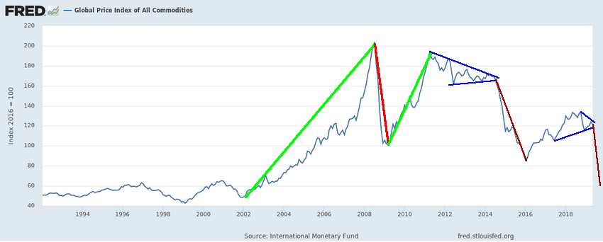
The price of commodities is a perfect example of how the 19th-century economy is purging itself while the new 21st-century economy is searching for a foundation/footing to take root. Oil is a prime example of the 19th-century economic foundation for growth and economic output. Yet in today’s world of solar, green and various other energy sources, Oil has fallen to near $52 ppb recently and could fall as low as $35 to $38 ppb in the future months. Considering Oil was recently above $120 bbp – what the heck happened?
This chart of the Index of All Commodities prices highlights the shift in capital and the shift in the economic mode of operation that is currently taking place. What was an increasing commodities price market in 2005~07 and 2010~12 has now been replaced with a decreasing commodity pricing market. Is this indicative of a collapse in the global economy? In some ways, yes. But we believe this is more indicative of a transitional economic shift away from 19th-century processes and functions and towards a more dynamic 21st century economic model for the globe.
This process, though, will be full of very large price swings, failures, successes, and opportunities for those skilled technical traders that are able to catch the moves and setup as they happen.
Lastly, the US Consumer Price Index chart. Notice how the GREEN highlighted area (from the early 1960s till 2000 were filled with positive CPI results? Notice how that changed in 2000 and how after 2000 the CPI levels fluctuated from positive to negative quite regularly? Now, pay attention to how the expansion of peaks immediately after the 2000 Dot Com bubble burst has been replaced with a contraction of peaks after the 2008-09 credit market crisis. What is causing the CPI to contract in this manner? Why is is that expansion of commodity pricing is unable to expand as it had been going for decades before 2008-09?
The key to understanding all of this is that the expansion prior to 2000 was an expansion fueled by rising wages, income, wealth creation and opportunity from a mature 19th-century economic model. The 1990 to 2000 narrow range in the CPI was related to the “early shift” away from the 19th-century economic mode and into the Dot Com (internet) mode of economic activity (where this new economic model was taking away from brick-and-mortar shopping malls and replacing it with virtual commerce activities. The recovery in 2005 was fueled by moderate quantitative easing in the US as well as a resurgence in more traditional economic functions related to the growth of economic opportunity in foreign nations, Europe and the push to expand digital technology throughout most of the developing world.
Then came the crisis of 2008-09, which was like blowing out 3 pistons of your V8 motor. You may still be able to limp the car around and back home, but you probably have to keep pouring high-octane fuel into it to keep it running and hope it does not blow out another piston or two.
This Custom Smart Cash Index chart is a perfect example of how capital works in the markets. It attempts to avoid risk by reducing exposure to risk events and attempts to pile into an opportunity as security and returns are setup for optimum outcomes.
Notice how in 2008 capital fled the global markets and how it slowly reentered the markets from 2011 to 2015. Pay attention to the dips in this Smart Cash Index and you’ll notice how these dips align with the US Fed and global central bank QE functions. Pay very close attention to the dip in 2015~2016. Why would cash want to avoid risks setting up during this time and what caused the global markets to fear excessive risks then? US Presidential elections – that’s what happened. And what is happening in November 2020? Yup – you guessed it.
Why would risks become so heightened at these times and throughout collapse events and where does capital rush into when these types of events happen?
CONCLUDING THOUGHTS:
In Part IV of this article, we’ll try to answer some of your bigger questions and we’ll explain why we believe an incredible opportunity is setting up for skilled technical traders over the next 24+ months.
Using technical analysis and proven strategies we can follow the market trends and profit from them no matter which the market moves. We bet with the market (the house) and provide entry, target, and stops for all trades we initiate.
NEXT MOVES FOR GOLD, SILVER, MINERS, AND S&P 500
In early June I posted a detailed video explaining in showing the bottoming formation and gold and where to spot the breakout level, I also talked about crude oil reaching it upside target after a double bottom, and I called short term top in the SP 500 index. This was one of my premarket videos for members it gives you a good taste of what you can expect each and every morning before the Opening Bell. Watch Video Here.
I then posted a detailed report talking about where the next bull and bear markets are and how to identify them. This report focused on gold miners and the SP 500 index. My charts compared the 2008 market top and bear market along with the 2019 market prices today. See Comparison Charts Here.
On June 26th I posted that silver was likely to pause for a week or two before it took another run up on June 26. This played out perfectly as well and silver is now head up to our first key price target of $17. See Silver Price Cycle and Analysis.
More recently on July 16th, I warned that the next financial crisis (bear market) was scary close, possibly just a couple weeks away. The charts I posted will make you really start to worry. See Scary Bear Market Setup Charts.
https://thegoldandoilguy.com/wp-content/uploads/2019/08/42.png342850adminhttp://www.thegoldandoilguy.com/wp-content/uploads/2014/11/tgaoglogo.pngadmin2019-08-14 12:20:572019-08-14 12:20:57Global Central Banks Move To Keep The Party Rolling – Part III