The precious metal market has been stuck in a strong down trend since 2012. But the recent chart, volume and technical analysis is starting to show some signs that a bottom may have already taken place.

This report focused on the weekly and monthly charts which allow us to see the bigger picture of where the precious metals sector stands in terms of its trend.

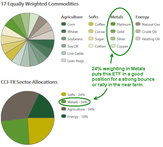
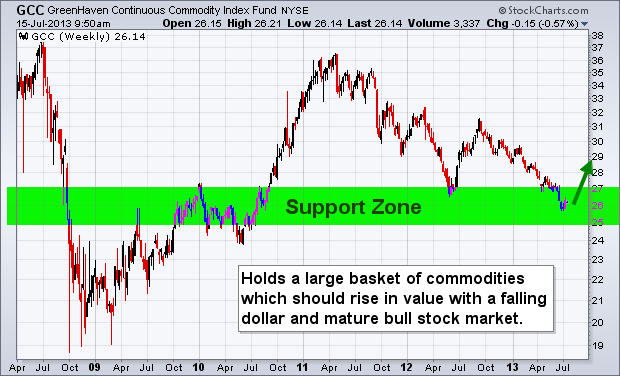
Let’s take a look at a few charts below for a quick overview, but if you want more interesting ones visit: https://stockcharts.com/public/1992897

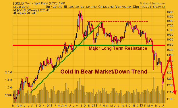
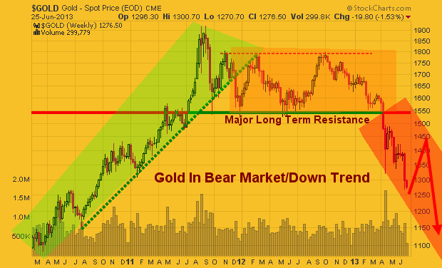
Gold Spot Price – Weekly Chart

This chart clearly shows the trends which gold has gone through in the last three years. With simple technical analysis trend lines, clearly price is nearing a significant apex which will result in a strong breakout in either direction.

Remember, this is the weekly chart, so we could still have another month or three of sideways chatter to work through. But a breakout in either direction will trigger a large move.

goldtrend


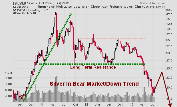
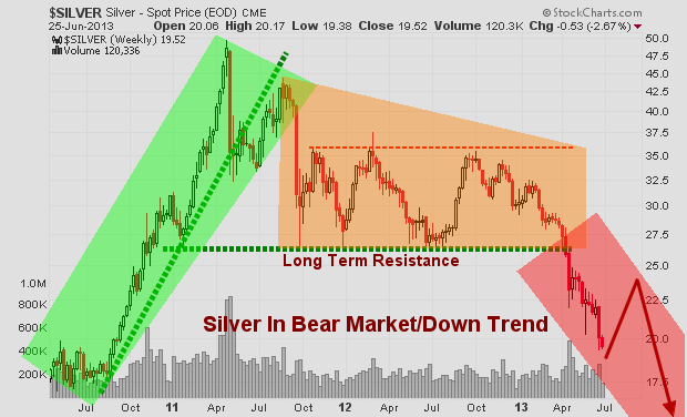
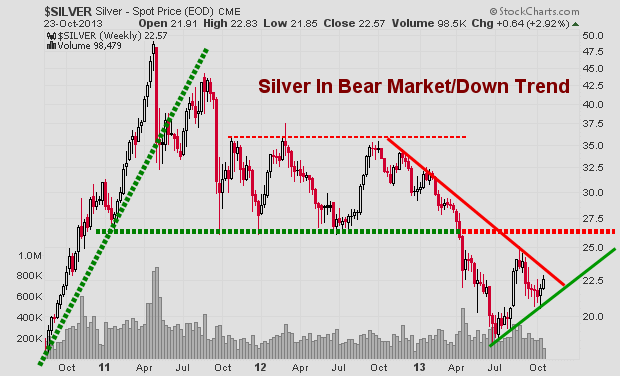
Silver Spot Price – Weekly Chart

Silver is also stuck in a similar pattern.  Currently the odds still favors lower prices and for the upper resistance trend line to reject price and send it lower. But if we keep out eye on the leading indicators like gold miners, we may be able to catch a breakout or traded the rejection of resistance in the next month or so.

silvertrend


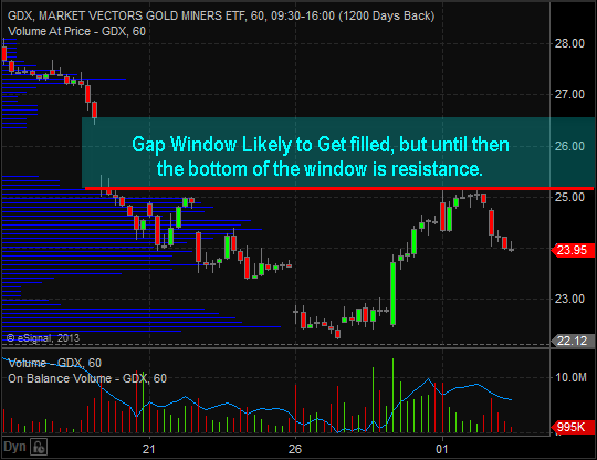
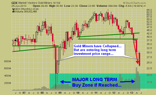
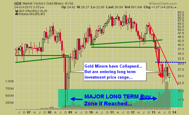
Gold Mining Stock ETF – Monthly Chart

Gold miners have a very sloppy looking chart. Price is extremely volatile and the recent price action in 2013 could go either way VERY quickly. I have a gut feeling GDX in the coming months could have a washout bottom and tag the $20 price level. While I hope I am wrong for many investors sake, if it does happen, it will be a very strong investment level to accumulate a position.

gdxtrend


Precious Metals Bigger Picture Outlook:

In short, I remain neutral – bearish for this sector.  In the next 1-3 months we are likely to see some strong price action which will be great. We need a breakout or bottoming pattern to form before we get involved at this level.

I know everyone is dying to get involved in precious metals again for another huge rally… but sometimes it’s just best to wait for the big picture chart to catch up with your bias before taking a position of size.

Get My Free Weekly Trading Sector Reports
Delivered To Your Inbox: www.GoldAndOilGuy.com

Last week on October 8th the financial market experienced a broad based sell off. Every sector was down with utilities being the only exception.

The individual leadership stocks, which are typically small to mid-cap companies (IWM – Russell 2K) that have a strong history and outlook of earnings growth, were hit hard as well.

Whenever the broad market experiences a price correction, one of the most important factors I analyze is how well leading stocks hold up and show relative strength to the broad market.

So, where does this leave us going forward?

When stocks that have been leading the market higher and only pausing during market corrections in the S&P500, Dow, and NASDAQ, it’s a positive sign. This tells us investors and big money continues to flow into the risk on assets (stocks).

Conversely, when these leading stocks/sectors begin succumbing to the selling pressure of the broad market, it quickly grabs my attention and tells us it’s time to be aware that a major top may be forming.

It looks as though the broad market rally is just barely hanging on. If the leading stocks and sectors begin breaking below their 50-day moving averages, my proprietary SP500 Market Timing & Trading System will shift to sell mode and things could get ugly for those who do not know how to trade a bear market.

Weekly Relative Strength Showing Negative Divergence

This chart has two important things I would like to point out. First is the fact that the RSI has being overbought twice in the past three years with the most recent one taking place a few months ago. The last time this took place the SP500 had a very strong correction.

The second insight the RSI is providing us with is the diverging price and relative strength as shown with the purple lines on the chart below. This is telling us that the power/momentum behind the market is slowing.

div1


Daily Bullish Percent Index – Shows Negative Divergence

I always prefer to watch and analyze the NYSE as it’s the big board where all the HUGE money is flowing from traders and investors. The chart below clearly shows that less stocks are moving higher as seen with the purple bullish percent index line. With less stocks making new highs, yet the stock market continues to climb this is a warning sign that this bull market is slowly running out of steam.


div2


Technology & Financial Sector Are Rising But For How Long?

Two very powerful sectors are holding up well but once they start to breakdown from these chart patterns things could get ugly real quick. Our 3x ETF trading newsletter becomes very active in bear markets as the upside potential is much larger.

The XLK technology sector looks to be forming a bearish rising wedge. If/once it starts to slide it will have a strong impact on the broad market.

div3

Financial Sector XLF

The recent price action of scattered trading ranges looks to be similar to the top we saw in 2011. If this is the case then we have bearish head & shoulders pattern with a rising neckline forming. Once price breaks through the neck line we should expect sharp drop in price.

This sector is heavily weighted in the SP500 so if it start to drop, expect the SP500 to fall with it.

dvi4


Major Market Top Lurking…

The chart below pointing out the next bear market likely to take place is a scary looking chart to most individuals. But if you know what you are doing, they can provide more profits in a shorter period of time than a four year bull market.

If this market is starting to stall out and is in the process of forming a top. Keep in mind that market tops are a process. They take typically 3-6 months to form before a true breakdown occurs and the bear market starts. And until then, price will be choppy and difficult to trade.

majorcycle


Cautious Trading Conclusion:

In short, this report shows you some major divergences in the financial market. Remember, you do not really trade off divergences, as they are not good at timing. They are simply a warning sign telling us that something large is brewing and that risk is higher than normal.

There are few ETFs I like on various sectors and commodities that show some oversized upside potential in the coming weeks/months. Depending on what takes place in Washington this week will move the market and likely trigger some sharp moves. Until then, sitting tight is the safe play.

Get my trading reports and my trade alerts at www.TheGoldAndOilGuy.com

Chris Vermeulen

During the recent weeks we have seen commodities especially precious metals continue to drop in value. Market participant sentiment has become more bearish on commodities and couple that with a rising dollar it’s no wonder why we continue to see commodities as a whole fall in value.

Money has been flowing out of bonds at record levels this summer telling us most of market participants are feeling bullish on the stock market. This shift in sentiment of the masses are typical as they move their money from the risk on safer assets (bonds & commodities) and rotate into risk-on assets like stocks. While this is a bearish (contrarian sign) stocks could easily continue to rally for an extended period of time and possibly several more months before they actually top out.


Let’s take a look at the financial market business cycle diagram:

Bond prices have been falling for months and they typically lead the stock market lower. I feel we are starting to enter the phase where stocks will soon top and head lower also. Once this starts money will naturally flow into safer assets that are more tangible like commodities.

Keep in mind this cycle is very slow moving and rotation from one phase to another takes months. This is a process not an event but it is still very tradable.

JMCycle


Now let’s fast forward to precious metals both gold and silver are likely to do in the next couple months. If you review the charts below you will see gold and silver bullion prices are looking primed for a bounce/rally from these deep oversold levels.


Gold Weekly Price

gold


Silver Weekly Price

sil;ver

Take a look at a basket of commodities through the GCC ETF.

GreenHaven Continuous Commodity Index Fund (GCC) is an Exchange-Traded Fund (ETF) that provides an innovative and efficient way to deliver broad based, diversified commodity exposure. It aims to achieve this by using futures contracts to track the Thomson Reuters Equal Weight Continuous Commodity Total Return Index (CCI). The CCI-TR is an equal weighted index of 17 commodities plus an additional Treasury Bill yield. Because of the equal weighting, GCC offers significant exposure to grains, livestock, and soft commodities and a lower energy weighting than many of its peers. In addition, GCC is rebalanced every day in order to maintain each commodity’s weight as close to 1/17th of the total as possible.

So, knowing metals are 24% of the index it bodes well for a bounce in the overall commodity index. Keep in mind this report is only focusing on precious metals, but many other commodities look ready to rally also like natural gas.

GCC-H


GCC – Continuous Commodity Index Fund Weekly Trading Chart

The chart below shows a very bullish 4 year chart pattern. At the very minimum a bounce to the $29 is highly.

gcc


Commodity Basket Trading Conclusion:

In short, commodities as a whole remain in a down trend. Until they show signs of real strength I will not be trying to pick a bottom. Several commodities are starting to look oversold and ready for a bounce like sugar, coffee, copper and natural gas.

Last month I talked about how a major market top is likely to unfold during the second half of this year. I still believe this to be true. But keep in mind these major market tops which only happen every few years are a MAJOR PROCESS. They take time to form and often we will see a series of new highs followed by quick sell offs as the market gets more people long as they big money distributes their shares/contracts into the new money rotating into the market.

If you want more reports and trade ideas join me at www.GoldAndOilGuy.com

Chris Vermeulen

Get My Daily Video, Intraday Updates & Trades Today!
www.TheGoldAndOilGuy.com

Chris Vermeulen

US Equities opened higher this morning and are setting up for a sharp pullback based on technical analysis using trends, cycles, momentum, volume, market breadth and key resistance zones.

Take a look at the charts below for a quick flash of what I think.

Barchart Market Momentum Index

This chart I look at daily. In short if its price is at 101 or higher I expect the broad market to pause or pullback within the next day.  It tells me if stocks have moved to far in one direction on a daily basis and if so sellers (big money players) are likely to re-align stocks by taking profits or shorting during these times.

Momentum1


Stock Trading Above the 50 Day Moving Average

Here we can see that while the SP500 has been rising over the past 6 months less stocks are trading above their 50 day moving average. This means a smaller group of stocks is holding the market up and it’s just a matter of time before those stocks burn out and roll over also.

Broadmarketstrength2


SPY Swing Trading Analysis – Daily Chart

With the SP500 breaking down from its trend channel and testing a short term resistance trend line. Odds favor sellers should become more active and pull the market down as they unload any remaining long positions and possibly get short the market. Both of these actions will put pressure on US Stocks.

SPYswingTrend


Big Picture Outlook – Don’t Get Me Wrong!

This chart is just to show you what is possible. I am not a perma-bear nor do I want another bear market like this to happen. But knowing what is possible still has to be known. Major market tops are a lengthy process and tends to take several months. If this is the case then it could be a wild and choppy market for the rest of 2013 and a great way to play this is through writing options. Do not expect price to just collapse and free fall for 18 months… Dreams like that do not happen. Bear markets must be actively traded as they carry a lot of risk.

SP500LongTermTop


Flash Chart Analysis Conclusion:

This week is do or die for US stocks. We need sellers to step in here and pull stocks down. With the SP500 trading at resistance, stocks being overbought on a short term basis and the holiday week behind us which typically favors higher prices it is now time for sellers to become active once again.

Get more timely updates at: www.GoldAndOilGuy.com

Chris Vermeulen


As talked about almost two weeks ago when the SP500 trend reversed to the down side we have been waiting for a bounce in price to short the market (buy and inverse ETF). That happened last week and now we are waiting for the market to shake out the short positions and suck in as many traders to get long before the next wave of major selling takes place.

It seems traders are becoming bullish again as prices rise and they are dumping their precious metal positions and rotating into equities again from the looks of things. Also if you know the Dow Theory then you know the industrial and transportation sectors tend to lead the broad market. Well today the only two sectors trading lower are just those two.

See the charts below for a visual:

sectorsdown


The Market Forecast Cycle Analysis, Trends & Signals


s

PYjy2

gdxjy2
All these things paint a clear picture for lower prices to come. But as we know, surprise news can change the technical outlook of the market from time to time. This is why constant analysis is needed along with protective stops for any open positions.

Chris Vermeulen
www.TheGoldAndOilGuy.com

Stocks managed their third session higher as of Thursday June 27th and its too late to jump onto that move. Major indexes and leading stocks have rebounded into resistance along with a few key moving averages. The next 1-3 days favor a pause or pullback at the least simply because of the selling momentum and multiple resistance levels being tested. It is only natural for traders and investors to pull some money off the table or short at these levels.

Stepping back seven days and looking at the overall stock market we have seen a substantial drop in prices across the board. A Ton of stocks have formed their first impulse thrust to the downside which is typically what happens when a stock market is in a topping process (Stage 3 Distribution). The type of damage we had cannot be fixed overnight. This will be a process if it is to resolve to the upside and price action will remain wild (volatile).

The odds from a technical analysis stand point using Price, Momentum, Cycles, Volume and Moving Averages point to lower prices still to come. Actually they point to another 5% drop from the current level.

Major Points to Be Aware Of:

1. 20 Simple Moving Average is crossing below the 50SMA. Last time this took place it triggered a 5% drop in the SP500.

2. Price has bounced for three consecutive days. This typically puts the odds in favor for a pullback.

3. Price bounced and hit it’s head on the 20 and 50 moving averages on Thursday (RESISTANCE).

4. Market Time Cycles are in a decline phase meaning there will be a negative bias and seller will be actively pulling price lower on bounces.

5. Major Long Term Chart looks favorable for a bear market to start which may last 12 months. If so this is just the beginning of some scary yet highly profitable potential trades in the coming year. Stocks fall 3-7 times faster than they rise…


Daily SP500 Trend & Analysis Chart:

spydaily


Long Term SP500 Trend Chart:

spymonthly


BEARISH SP500 Price & Volume – 60 Minute Intraday Chart:

spyintraday


Looking at these charts from a long term, intermediate and short term basis the odds are favoring lower prices. Being short stocks or buying inverse ETF’s is the current play for the market. But analysis and trends are subject to change depending on price and volume action each week. Do not get your heart set on the BIG picture outlook of a yearlong selloff. That could prove to be dangerous. We take this market one bar or candlestick at a time and trade based on current short term analysis.

Get My Trade Alerts & Pre-Market Video Analysis Every Day: www.GoldAndOilGuy.com

Chris Vermeulen

The life cycle of most things not matter what it is (living, product, service, ideas etc…) go through four stages and the stock market is no different. Those who recently gave in and bought gold, silver, mining stocks, coins will be enter this stage of the market in complete denial. They still think this is a pullback and a recover should be just around the corner.

Well the good news is a recovery bounce should be nearing, but if technical analysis, market sentiment and the stages theory are correct then a bounce is all it will be followed by years of lower prices and dormancy.

I really do hate to be a mega bear or mega bull on anything long term but the charts have painted a clear picture this year for precious metals and I want to share what I see. Take a look at the chart below which shows a typical investment life cycle using the four stage theory.

The Four Stages Theory

Classic economic theory dissects the economic cycle into four distinct stages: Accumulation, Markup, Distribution, and Decline.  Stock, index or commodities are no different, and proceeds through the following cycle:

  • Stage 1 – Accumulation: After a period of decline a stock consolidates at a contracted price range as buyers step into the market and fight for control over the exhausted sellers.  Price action is neutral as sellers exit their positions and buyers begin to accumulate.
  • Stage 2 – Markup: Upon gaining control of price movement buyers overwhelm sellers and a stock enters a period of higher highs and higher lows.  A bull market begins and the path of least resistance is higher.  Traders should aggressively trade the long side, taking advantage of any pullback or dips in stock price.
  • Stage 3 – Distribution: After a prolonged increase in share price the buyers now become exhausted and the sellers again move in.  This period of consolidation and distribution produces neutral price action and precedes a decline in stock price.
  • Stage 4 – Decline: When the lows of Stage 3 are breached a stock enters a decline as sellers overwhelm buyers.  A pattern of lower highs and lower lows emerges as a stock enters a bear market.  A well-positioned trader would be aggressively trading the short side, taking advantage of the often quick decline in share price.

Stages1


Gold Price Weekly Chart – Stages Overlaid

gold11


Silver Price Weekly Chart – Stages Overlaid

silver11


Gold Mining Stocks – Monthly Chart

This chart is a longer term picture using the monthly chart. I wanted to show you the 2008 panic selling washout bottom in miners which I think is about to happen again. While physical gold and silver are in a bear market and should be some a long time, gold mining stocks will likely find support and possibly have a strong rally in the coming months.

Many gold stocks pay high dividends and are wanted by large institutions and funds. The lower prices go the higher the yield is making them more attractive. So I figure gold miners will bottom before physical metals do. A bounce is nearing but at this point selling pressure and momentum continue to plague the entire PM sector.

gdx11


Precious Metals Investing Conclusion:

In short, I feel with Quantitative Easing (QE) likely to be trimmed back later this year, and with economic numbers slowly improving along with solid corporate earnings the need or panic to buy gold or silver is diminishing around the globe.

While there are still major issues and concerns internationally they do not seem to have any affect on precious metals this year. Long terms trends like the weekly and monthly charts shown in this report tends to lead news/growth/lack of growth by several months. So lower precious metals prices may be telling us something very positive.

The precious metals sector is likely to put in a strong bounce this summer but after sellers will likely regain control to pull prices much lower yet.

Get My Daily Analysis and Trade Alerts: www.TheGoldAndOilGuy.com

Chris Vermeulen

I have previously written Fed/POMO and I have to do mention it again.  Yesterday morning I mentioned that if this trend is to remain up big money needs to be stepping into the market to lift stocks and save the trend. Luckily for the market and Ben Bernanke, there was a huge POMO day scheduled for yesterday where the Fed could buy up to $3,500,000,000 of securities.

POMO

That massive QE buying pressure (POMO – Permanent Open Market Operations) I’m sure helped lift the market. Look at my simple yet effective technical traders analysis chart of SP500 Futures below.

Friday

The Fed’s massive securities purchases likely helped to trigger a strong short-covering push into the closing bell.  Remember, the prior day the indices had been hammered as short sellers drove the markets lower. When the shorts are forced to cover their positions, they do so by buying.  When strong enough, this produces strong waves of buying.

Remember not to be bias in your outlook on the market, but follow the trend, money and momentum and you should be on the correct side of the market more times than not.

Chris Vermeulen
www.TheGoldAndOilGuy.com