With 2012 now behind us it’s time to start looking for some new long term investments which have big potential gains in the new year. Copper is one metal that has caught my eye.

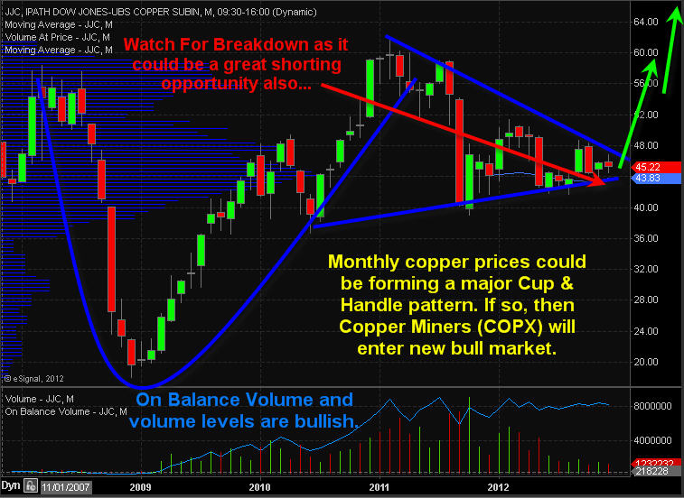
The long term monthly chart of the copper ETF JJC shows a potential cup and handle pattern accompanied with bullish volume characteristics. Last year copper traded sideways in a narrowing range. This type of price action tends to bore traders and investors forcing them to look elsewhere for new to trades. The saying is “If the market doesn’t shake you out, it will wait you out”

You can see on the monthly chart that the interest in this commodity diminished. You can tell because of the sideways movement and declining volume. I like to focus on investments which are out of favor but are showing signs of another big trend starting. getting on the train before it leaves the station can make for a fun ride. I do post some of my trading ideas with my charts updating live each day here: https://stockcharts.com/public/1992897

Take a look at the charts, analysis and my best copper stock setup below:

JJC – Copper Total Return ETN Profile

Description: The index includes the contract in the Dow Jones-UBS Commodity Index Total Return that relates to a single commodity, copper (currently the Copper High Grade futures contract traded on the COMEX).

CopperMonthly


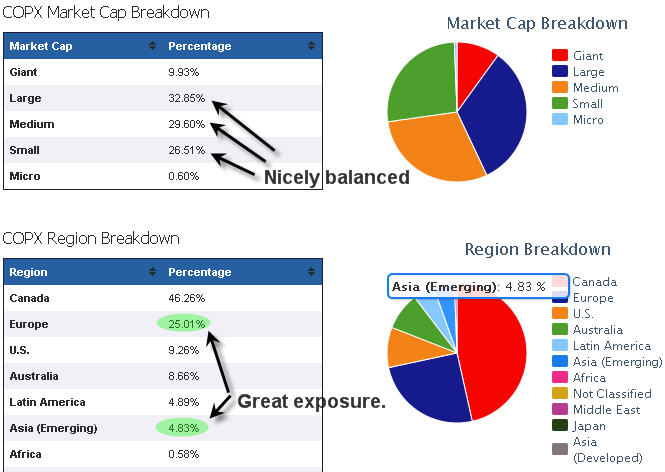
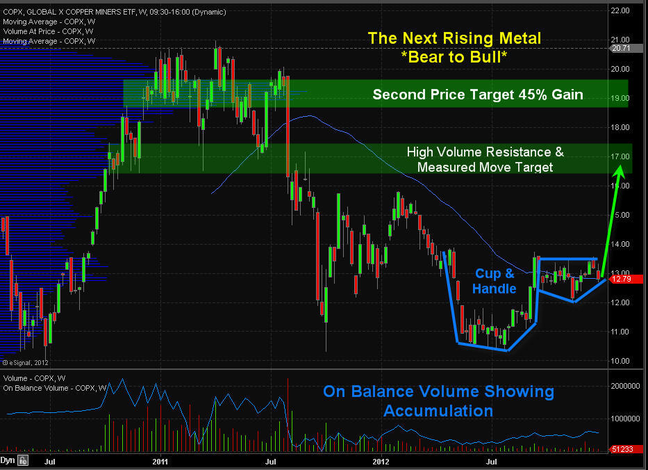
Copper Miner Stocks ETF COPX – Weekly Chart

This ETF holds a basket of copper mining stocks which is showing signs of a new trend starting. Take a look at the top holdings stocks and fund breakdown to get a feel for the exposure it provides.

COPX Top Ten Holdings

  1. Inmet Mining Corporation (IEMMF): 6.62%
  2. KGHM Polska Miedz SA (KGH): 5.24%
  3. Xstrata PLC (XTA): 5.04%
  4. Grupo Mexico, S.A.B. de C.V. (GMEXICO B): 4.89%
  5. Jiangxi Copper Company Limited H Shares (00358): 4.83%
  6. HudBay Minerals, Inc. (HBM): 4.82%
  7. Antofagasta PLC (ANTO): 4.78%
  8. Southern Copper Corporation (SCCO): 4.75%
  9. Lundin Mining Corp (LUNMF): 4.55%
  10. Kazakhmys PLC (KAZ): 4.55%

CopxInfo

DEc28Copx


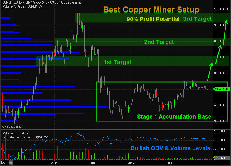
Best Copper Stock Setup – LUNMF

After reviewing the main holdings in this fund I noticed one stock that looks ready to start a new bull market. Lundin Mining. shares look to be building a Stage 1 base and could break out and start to rally any week. Keep in mind 3/4 stocks move with the broad market so we do want the major indexes to find a bottom or at least trade sideways if we want copper stocks to start their run.

CopperMiner


Copper Futures, ETF and Stock Trading Conclusion:

Copper has lost its shine over the past 12 months but could start to make headline news in the near future. I like both COPX and LUNMF if we see further strength. If you would like to get more of these trading and investing ideas and alerts be sure to join my newsletter at: http://www.TheGoldAndOilGuy.com

Chris Vermeulen

Disclaimer:
I currently do not own a position in these investment but plan on buying them in the near future. This material should not be considered investment advice. Chris Vermeulen is not a registered investment advisor. Under no circumstances should any content from this website, article, video, seminar or email from Chris Vermeulen (TheGoldAndOilGuy.com) be used or interpreted as a recommendation to buy or sell any type of security or commodity contract. This material is not a solicitation for a trading approach to financial markets. Any investment decisions must in all cases be made by the reader or by his or her registered investment advisor. This information is for educational purposes only.

Coffee prices have fallen more than 50% since 2010 which can be seen through the coffee exchange traded fund symbol: JO. This investment seeks to replicate the returns that are potentially available through an unleveraged investment in coffee futures contracts as well as the rate of interest that could be earned on cash collateral invested in specified Treasury Bills.

Weekly, Hourly and Seasonal chart of JO Coffee Exchange Traded Fund

The top weekly chart shows my price targets for 2013 while the lower hourly chart shows strong on balance volume meaning big money is slowly building a long position in coffee. The small white chart is the seasonal chart of coffee futures showing prices historically rise from Jan – March, then a correction followed by another rally in to May.

Coffee prices are still in a down trend but it looks as though the end is near and if played properly it could provide up to 100% return on your capital in 2013.

Dec28JO


Coffee Futures Monthly Long Term Chart

This chart gives you a bird’s eye view on where coffee prices are trading in the big picture scheme of things.

CoffeeLongTermMonthly


JO Coffee ETF VS. SBUX Starbucks Share Price:

Lower coffee bean prices has helped lift share prices of coffee companies like Starbucks: SBUX, Coffee Holdings Co.: JVA, Coffee Roasters Inc.: GMCR, and PEET’s Coffee: PEET. But cheap coffee may not be around that much longer and the lower earnings for coffee brewers may be closer than most may think.

Follow my Live Trading Charts Here Free: https://stockcharts.com/public/1992897

CoffeeBrewer


2013 Caffeine Conclusion:

In short, I have been watching coffee prices for a bottoming pattern for months and I now feel it is getting really close to a bottom and it could be a great trade and investment in the new year. As for companies like Starbucks it will likely not have much of an affect on the bottom line until the second half of the year though it is something to keep an eye on during earning seasons.

If you want my trading and investing ideas each week along with trade alerts for ideas like this then join my newsletter today: http://www.TheGoldAndOilGuy.com

Chris Vermeulen

Chris Vermeulen – www.TheGoldAndOilGuy.com

We all want new and exciting electronic gizmos and gadgets for the holiday season. Unfortunately they have the tendency to lose almost all their value within weeks because of newer versions etc… but what if you just got a lump of dirty old coal in your stocking, how would you feel?

The only individuals who would appreciate a dirty gift like that would be those forward looking investors who see major opportunities before they become the next big movers and headline news.

Knowing how to spot Stage 1 patterns is one of the most important bits of information you need to know as an investor. This one pattern is how I found RIMM which now up 100% in the past 30 days, ANR up 30% in two weeks, FSLR up 20% in 20 days and the list goes one. My main focus is on ETFs because of lower risk they provide but very powerful when applied to individual stocks.

Coal and coal stocks have been out of favor for almost two years now. But these unwanted and hated shares may soon be owned by the masses, or at least by traders and investors. A few weeks ago to I talked about the four stages all investments go through and which patters you must be able to spot in order to make huge money investing while having very limited downside risk.

You can read about them here where I used Apple and Research In Motion shares as my example: http://www.thegoldandoilguy.com/collapse-of-apple-rise-of-the-blackberries-stock-market-cycle/

In summary, Trade with the BIG BOARD and only focusing on buying stocks, ETFs etc… as they are coming out of a Stage 1 Accumulation Basing Pattern. This puts the odds greatly in your favor for not only winning the majority of your trades but to generate above average returns.

The BIG BOARD – NYSE – Weekly Major Stock Market Trend

The New York Stock Exchange is the big board. This chart formed a reversal candle last week which points to lower prices. Its likely we see a 1-2 week dip before buyers step back in. Until then individual stocks should pause or form mini bull flags until the sellers are finished and buyers step back into risk on assets (equities).

NYSEWeekly

Coal Sector ETF Showing Stage 1 Basing Pattern

Coal stocks have been bouncing bottom for some time and if you did not review the Stages Report using the link above then do so now so you know what to expect in detail.

KOL coal exchange traded fund is a basket of coal companies and is starting to show signs of a new bull market. A breakout and close above $26.00 should trigger strong buying with the potential of a 21% gain before it hits my first price target. This could go way past that but one target at a time folks.

Naturally I would like to see a bull flag or pause in KOL over the next couple weeks, then look to get long using the pivot low of that pause/bull flag as my protective stop. I’m not jumping in here as the broad market looks ready to correct and ¾ stocks follow the big board which will pull KOL down.

KOLBase


ANR – My Top Coal Stock Pick

I pointed out ANR at $7.50 at the beginning of December to followers as it was the best looking coal stock I could find. The two key indicators “Price” and “Volume” were clearly pointing to higher prices and the potential gain even if it was just played up to the Stage 1 Resistance Level still netted a 30% move. Crazy part is that there is the potential for a 100% rally to my first price target. Follow my free ideas here live: https://stockcharts.com/public/1992897

ANRCoal


You want Gizmos or Coal in You’re Stocking???

In short, I really like the coal sector for the first quarter of 2013. I’m not too worried about the fiscal cliff as it’s not the end of the world and the US along with most other countries are all bankrupt together in my opinion. New rules and ideas will be implemented and life and business will continue… I am not to worried.

I am expecting stocks to continue sideways or higher into May at which time a serious correction could take place. But not to worry as we take things one week at time and will be adjusting my outlook accordingly.

Get My Trade Ideas & Alerts Delivered To Your Inbox: www.TheGoldAndOilGuy.com

Chris Vermeulen

Yesterday’s price action was very bearish yet again and we are patiently waiting for a counter trend pullback to happen. While three are some good looking plays out there I really do not want to get long until the market clears the air with a bout or three of strong selling. Remember 3:4 stocks follow the market and the odds of picking a commodity or ETF that bucks the trend is unlikely. If you are interested in powerful stocks & ETFs the buck the trend check out my FREE Trading Ideas live Go Here: https://stockcharts.com/public/1992897

SP500 / Broad Stock Market:

We have seen a bug run up in stocks this month and things are looking a little long in the teeth. A large number of stocks are trading above their upper Bollinger band and the broad market is testing that key resistance level also. Typically when a Bollinger band is reached we see price reverse for a couple days at minimum.

While the equities market is in a new uptrend as seen by the moving averages I pullback seems imminient. The last two days has formed reversal candles and are pointing to lower prices.

Dec12SPY


Dollar Index Hourly Chart:

This chart shows a possible bottom forming in the dollar pointing to a 3-8 day pullback in stocks.

Dec13DXBottom


Gold Futures Hourly Chart:

Dec13Metals


Natural Gas Hourly Chart:

Dec13NatGas


Morning Trading Conclusion:

Looking at the charts on several different time frames, not all shown here, technical analysis shows a pullback in stocks is highly likely. This is what we are currently positioned for.

The US dollars downward momentum is slowing and if it can find a bid today it should trigger strong selling in both stocks and commodities. Gold and silver are down sharply along with miners.

We have been watching natural gas for a few months and know that it has been trading inverse to what stocks do. This bodes well for a bounce in natural gas if stocks start a sell off. That being said, natural gas is trading at a key tipping point that could spark a very fast and hard drop. This knife can fall at a speed that will take a slice out of your trading account if not traded and managed properly (tiny position and use of a stop). I actually like natural gas the more it moves down and could issue a buy alert on it today or this week. I would like to see volume decline at this level showing the momentum is slowing…

Get My ETF Trade Alerts Now: www.TheGoldAndOilGuy.com

Chris Vermeulen

Chris Vermeulen – www.TheGoldAndOilGuy.com

Oil and gas along with their equities have been underperforming for the most part of 2012 and they are still under heavy selling pressure.

I watch the oil futures chart very closely for price and volume action. And the one thing that is clear for oil is that big sellers are still unloading copious amounts of contracts which is keeping the price from moving higher. Oil is trading in a very large range and is trending its way back down the lower reversal zone currently. Once price reverses back up and starts heading towards the $100 and $105 levels it will trigger strong buying across the entire energy sector.

Crude Oil, Energy & Utility Sector Chart – Weekly Time Frame

The chart below shows the light crude oil price along with the energy and utilities sectors. The patterns on the chart are clearly pointing to higher prices but the price of oil must shows signs of strength before that will happen. Once XLE & XLU prices break above their upper resistance levels (blue dotted line) they should takeoff and provide double digit returns.

Oil Sector Trading XLU XLE

Looking at the XLU utilities sector above I am sure you noticed the steady rise in the price the last couple of years. This was a result in the low interest rates in bond price and a shift from investors looking for higher yields for their money. Utility stocks carry below average risk in the world of equities and pay out a steady and healthy dividend year after year. So this is where long term investment capital has/is being parked for the time being.


Utility Stock Sector – Deeper Look – 2 Hour Candle Chart Time Frame

Last week I covered utility stocks in detail showing you the Stage 1 – Accumulation base which they had formed. The chart below shows the recent price action on the 2 hour candle chart and recent run up. You can learn more about how to take advantage of this sector here: http://www.thegoldandoilguy.com/its-the-season-to-own-utility-stocks/

Utilities Sector Trading XLU


Oil and Gas Services – Daily Time Frame

This chart shows a very bullish picture for the services along with its relative strength to oil (USO) at the bottom. While the sector looks a little overbought here on the short term chart, overall it’s pointing to much higher prices.

Oil Gas Services XES


Energy Sector Conclusion:

In short, crude oil looks to be trading in a VERY large range without any sign a breakout above or below its channel lines for several months at the minimum. But if the lower channel line is reached and oil starts to trend up then these energy related sector ETFs should post some very large gains and should not be ignored.

Get These Weekly Trade/Investment Ideas In Your Inbox FREE: www.TheGoldAndOilGuy.com

Chris Vermeulen

We don’t hear much about gold and silver anymore on the news. This time last year you could not go 5 minutes without a TV or radio station talking about them. Why is this? Simple really, precious metals have been building a Stage 1 Basing Pattern for the last 12 months. This boring sideways trading range is how the market gets most of those long holders out of an investment before it starts another move up. The saying is “If the market doesn’t shake you out, it will wait you out”.

We all know time is money so the above statement makes a lot of sense doesn’t it? Instead of having your money sitting in an investment that has clearly displayed a large sideways range with month and possibly years before any significant breakout will occur, why would you want their money in it doing nothing? There are other opportunities which you could be putting your money into that could generate more gains until the precious metals sector sets up with a high probability trading pattern.

The good news is that gold, silver and precious metal miner stocks are forming a very large Stage 1 Accumulation pattern on the weekly chart. This points to a multi month rally in prices if they breakout above our resistance levels.


Gold & Gold Miner Stocks Weekly Analysis:

The chart below shows a lot of analysis and to the untrained eye this may look messy and confusing, so take your time to review it. In short, what I am showing are sideways price patterns using the previous highs and lows for support and resistance levels. The analysis shows the shift in prices from bearish (down), to Neutral (sideways). The exciting part about this pattern is that a new bull market should emerge if my analysis is correct. Now, I’m not talking about 5 -10% move here, I’m talking about a multi month and possibly a yearlong rally in precious metals that could allow some individuals to retire early if played properly…

A break above our red dotted resistance lines should trigger aggressive buying in gold miners along with physical gold bullion.

Gold Miners ETFs

In the past month I have been giving out some of my Stage 1 trading ideas which have generated some decent gains for those who follow along. All but one have generated gains with FSLR 12.5%, FB 12%, RIMM 54%, AAPL 5%, TLT 2.5%, XLU 1.5%, and KOL down -5.2%. Keep in mind that you can follow my trading charts live for free and get some of my stock and ETF trading ideas here: https://stockcharts.com/public/1992897


Silver & Silver Miner Stocks Weekly Analysis:

This chart of silver and silver miner stocks (SIL), shows a very similar pattern to that of its big shiny sister (Yellow Gold). Silver carries a lot more risk because of its industrial usage. Also this commodity is thinly traded and can move very quickly on a daily basis compared to gold. Because of these quick price movements it has attracted a lot of speculative money which also has increased the volatility. More often than not silver will move 2-3 times more on a percentage bases than that of yellow gold.

Silver Miners ETFs


Battle of the Miner ETFs Weekly Performance:

This chart compares three precious metals miner ETFS (GDX – Gold Miners, SIL – Silver Miners, NUGT 3x Leveraged Gold Miners).

Silver miners have held up the best because the herd saw how big the move was a year ago and are front running the next potential rally. But, depending on how you read the charts and sentiment it may be pointing to the dormant gold miners for a bigger than expected rally. But debating which one will breakout and run the most is a conversation/debate of its own and even I can argue both sides. The safe play is that even if gold miners (GDX & GDXJ) underperform the silver miners (SIL), the NUGT which is 3x leveraged gold miners should be the same if not outperform silver miners.

Precious Metals Mining Stocks


Precious Metals & Miners Trading Conclusion:

In short, I favor trading the miners over physical bullion simply because the charts show much more profit potential than if one was to buy the bullion exchange traded funds GLD and SLV.

The market seems to be setting up for some very large moves in 2013 and members of my trading newsletter should do very well. Be sure to join and follow along at www.GoldAndOilGuy.com

Chris Vermeulen